淺談jquery數據圖(報表)
在一個大數據的時代,不管是每個月的會計財報,還是金融投資,
都會有許多大大小小的數字需要去紀錄,並且需要做成一個分析報表,
讓使用者更有效率且清晰的了解數字的關係,讓我們用現成的套件,
再帶入簡單的參數就能匯出一份精美的報表囉~~~
現在就跟著這篇文章一起淺談jQuery的報表製作吧!!!!
想在Web網頁上顯示「折線圖」、「長條圖」、「圓餅圖」等圖形,以往都是透過繪圖軟體製作圖檔再用Flash製作動畫。
現在因為HTML的Canvas API與支援SVG瀏覽器漸漸普及,因此開始有人利用JavaScript製作動畫,
本篇文章主要要介紹如何用JQuery製作可與滑鼠互動的動畫圖形。
製作重點:
1.將圖形基本選項設定樣板化
2.調整欲修改的選項
3.將選項作為參數繪製圖形
支援的瀏覽器
IE8以上;Chrome 16以上;
Firefox 12以上;Safari 5以上;
iOS 4以上;Android 3以上。
使用JavaScript繪圖大致上會利用:
1.JavaScript函示庫
2.jQuery外掛
有多種不同描繪功能的外掛:
1.較具代表性且人氣很高的「jqPlot」
2.jQuery UI開發的核心「jQuery visualize」
3.可以動畫顯示圖表的JavaScript函示庫「chat.js」
以上均透過Canvas API 進行圖表的繪製。
本次範例使用SVG繪製圖表,並讓其可與滑鼠進行互動因此在程式中會用到SVG繪製的raphael.js與增強繪製功能的elychat.js
1.raphael.js:針對無支援SVG的IE9提供VML環境,讓舊的瀏覽器仍可以舊版向量的方式進行描繪與顯示動畫。
2.elychat.js:強化raphael.js的繪圖,外掛中有用到部分的舊的JQuery語法,可能會造成新版的JQuery判斷成錯誤,
因此程式中會引用jQuery migrate外掛,如此新舊語法才可相對應。
raphael.js(http://dmitrybaranovskiy.github.io/raphael/)
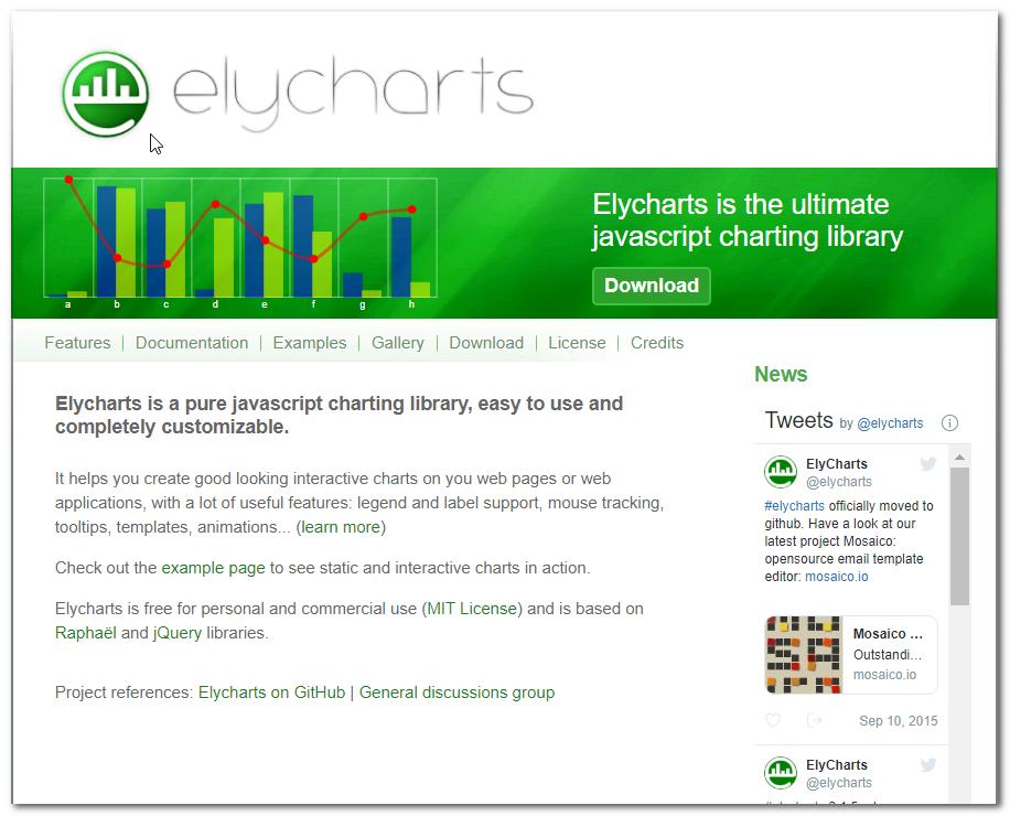
elychart.js(https://elycharts.com/)
<script src="http://code.jquery.com/jquery-1.10.1.min.js"></script>
<script src="http://code.jquery.com/jquery-migrate-1.2.1.min.js"></script><-載入jQuery新舊語法對應的jQuery migrate
<script src="js/raphael-1.5.2.js"></script><-載入SVG繪製用的jQuery外掛raphael.js
<script src="js/elycharts.min.js"></script><-載入最後繪製圖形的外掛
elycharts外可用Javascript設置數值資料、圖形外觀、動畫等,具體而言是在HTML上配置該圖形顯示位置的標籤:
1.標籤會設定特定的 css選擇器
2.使該元素呼叫chart()方法,傳入chart()方法的選項參數是圖形繪製的相關資訊,設定項目不少,一開始可能造成混淆。
3.各圖形都有繼承common(共同)的設定,透過當中的type參數可以區分為「line」(折線圖/長條圖)、「pie」(圓餅圖),其他就是個圖形自有的選項參數。
common(共同設定)
template
type
style
interactive等
defaultSeries(圖形基本設定)
visible
color
plotProps
tooltip
highlight
startAnimation
stepAnimation
label
lagend等
series(圖形個別設定)
empty
root等
features(特定功能的相關設定)
tooltip
mousearea
highlight
animation
frameAnimation
pixelWorkAround
label
shadows
balloons
legend等
pie 基本設定(圓餅圖)
cx
cy
r
startAngle
clockwise
valueThresold
defaultSeries(圖形基本設定) r
inside等
line 基本設定(折線圖/長條圖)
barMargins
defaultSeries(圖形基本設定)
normalize
min
max
prefix
suffix
labels
labelsDistance
labelsRotate
labelsProps
labelsCompactUnits
labelsFormatHandler
labelsSkip
labelsAnchor
labelsPot
labelsHideCovered
labelsMargin
labelsMarginRight
tittleDistance
tittleDistanceIE
tittleProps等
axis(軸的個別設定)
l
r
x等
defaultSeries(圖形基本設定)
type
axis
cumulative
rounded
lineCenter
stacked
plotProps
barWidthPerc
fill
fillProps
dot
dotProps
dotShowOnNull
mouseareaShowOnNull
startAnimation等
features(特定功能的相關設定)
grid等
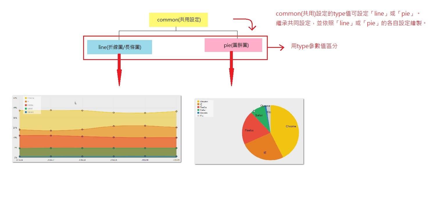
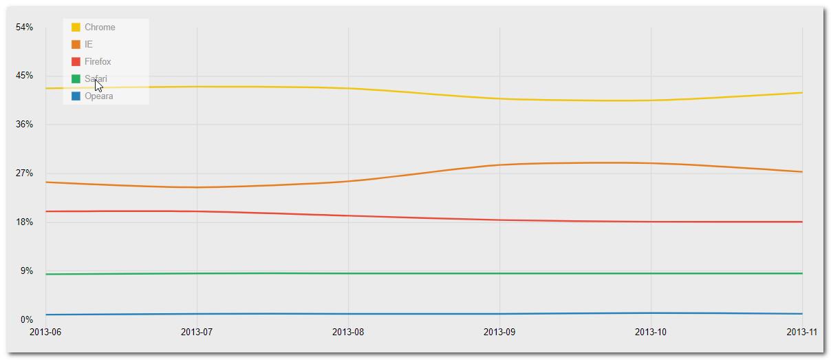
一、折線圖的範例:
1.用變數紀錄選項設定,折線圖為「line」
2.設定圖形周圍的空白,用陣列分別設定「上、下、左、右」,可依找軸標籤顯示適當的調整
3.用陣列的形式將數值設定給value的選項,本範例要顯示五條折現,分別以serie1-serie5表示。
4.設定圖形顏色、項目圖標等,個數需與顯示的圖形相同。
5.defauktSeries設定圖形的基本設定,其繼承common設定與line基本設定的設定,可以設定折現的寬度與項目圖標的文字顏色
程式碼如下:
html內容僅有:
<div id="chart1_1" class="chart"></div>
Javascript:
(function (d, $) {
var jQdm_graph;
jQdm_graph = function(){
//
// 橫軸、縱軸標籤與項目圖標、網格背景顯示的折線圖
//
var sample1_1_setting = { // 基本參數
type : "line",
margins: [20, 40, 40, 40],//設定圖形margin
labels: // 橫軸Label
["2013-06","2013-07","2013-08","2013-09","2013-10","2013-11"],
values: { // 各圖的值
serie1 : [42.68,43.12,42.78,40.8,40.44,41.87],
serie2 : [25.44,24.53,25.55,28.56,28.96,27.31],
serie3 : [20.01,20.09,19.25,18.36,18.11,18.15],
serie4 : [8.39,8.59,8.57,8.52,8.54,8.5],
serie5 : [1.03,1.1,1.16,1.16,1.2,1.18]
},
series: { // 各圖的顏色
serie1 : {
color : "#f1c40f"
},
serie2 : {
color : "#e67e22"
},
serie3 : {
color : "#e74c3c"
},
serie4 : {
color : "#27ae60"
},
serie5 : {
color : "#2980b9"
}
},
legend: { // 各圖的圖標
serie1 : 'Chrome',
serie2 : 'IE',
serie3 : 'Firefox',
serie4 : 'Safari',
serie5 : 'Opeara'
},
defaultSeries: { // 圖形設定
plotProps: { // 設定圖形外觀
"stroke-width": 2 // line圖形的線寬
},
legend: { // 圖標內容的樣式設定
textProps: { // 圖標字形的樣式
fill: "#999"
}
}
},
defaultAxis: { // defaultAxis(軸)的設定
max: 50, // x -> 50 値的最大値
labels: true, // false -> true 設定是否顯示軸的label
labelsDistance: 15, // 8 label間的距離(px)
labelsProps: { // label樣式
font: '10px Arial',
fill: "#000"
},
labelsAnchor: "auto", // auto 設定軸label的anchor點(以labelDistance、labelRotate為基礎點)
//auto:軸label的中央
//start:軸label的右側
//end:軸label的左側
labelsMargin: 0, // 0 軸label的margin,設定縱軸上方margin與橫軸左側margin
},
features: { // 設定部分的設定
grid: { // grid的設定
nx: "auto", // auto 橫軸label顯示數
ny: 6, // 縱軸label顯示數
draw: true, // false -> true 是否顯示grid
props: { // grid樣式
stroke: '#dadada', // #e0e0e0
"stroke-width": 1
},
extra: [0, 0, 10, 0] // [0,0,0,0] 格線的超出寬度[上, 右, 下, 左]
},
legend: { // 圖標額外設定
x: 60, // 'auto' 圖標的x作標,當horizontal為true時,auto有效
y: 10,
width: 100, // horizontal為true時,auto有效
height: 100,
itemWidth: "fixed",
// fixed 圖標各項目的寬度,fixed為固定。
margins: [0, 0, 0, 0],
dotMargins: [10, 5], // sx, dx
borderProps: {
fill: "rgba( 255, 255, 255, 0.5)",
stroke: "black",
"stroke-width": 0
},
// 下面defaultSeries設定為優先
dotType : 'rect',
dotWidth : 10, dotHeight : 10, dotR : 4,
dotProps : {
type : "rect",
width : 10,
height : 10,
"stroke-width" : 0
},
textProps : { font: '12px Arial', fill: "#000" }
}
},
axis: {
l: {
suffix: '%'
}
}
};
// 繪製圖
$("#chart1_1").chart(sample1_1_setting);
// 將圖製作樣版
$.elycharts.templates['template_sample1_1'] = sample1_1_setting;
結果如下:
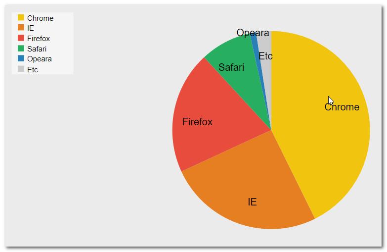
一、圓餅圖的範例:
1.相較於折線圖其設定較少,因此比較簡單。
2.首先將圖形型態改為「pie」
3.設定label、legend(個項目圖標)、tooltip,設定方法與折線圖相同,差別在於圓餅圖只需要在一個serise中設定
4.設定圓餅圖的startAngle與clockwise設定。
a.startAngle設定圓餅圖的起始點,設定從360度開始。
b.clockwise是否以順時針的方式繪製
程式碼如下:
html內容僅有:
<div id="chart3_1" class="chart"></div>
Javascript:
(function (d, $) {
var jQdm_graph;
jQdm_graph = function () {
//
// 繪製Label、圖標、tooltip的圓餅圖
//
var sample3_1_setting = { // 選項設定
type: "pie", // 設定圖形型態為圓餅圖
margins: [10, 10, 10, 10], // [10,10,10,10] 設定圖形margin
labels: [ // 各圖形的label
'Chrome', 'IE', 'Firefox', 'Safari', 'Opeara', 'Etc'
],
values: { // 各圖形的值
serie1: [42.68, 25.44, 20.01, 8.39, 1.03, 2.45]
},
legend: [ // 各圖形的圖標
'Chrome', 'IE', 'Firefox', 'Safari', 'Opeara', 'Etc'
],
tooltips: { // 各圖形的tooltip
serie1: ["Chrome 42.68%", "IE 25.44%", "Firefox 20.01%", "Safari 8.39%", "Opeara 1.03%", "Etc 2.45%"]
},
startAngle: 270, // 0 圓餅圖開始繪製的角度
clockwise: true, // false 是否順時針
defaultSeries: { // 設定圓餅圖
r: 1, // 1 圓餅圖大小比例。設定1~-1,-1為甜甜圈形狀
plotProps: {
"stroke-width": 0,
opacity: 1
},
values: [ // 各圖形設定
{
plotProps: {
fill: "#f1c40f"
}
},
{
plotProps: {
fill: "#e67e22"
}
},
{
plotProps: {
fill: "#e74c3c"
}
},
{
plotProps: {
fill: "#27ae60"
}
},
{
plotProps: {
fill: "#2980b9"
},
label: { // 讓label清楚顯示,所以調整其預設位置
offset: [80, 0]
}
},
{
plotProps: {
fill: "#ccc"
},
label: { // 讓label清楚顯示,所以調整其預設位置
offset: [40, 0]
}
}
],
label: { // 於圖上顯示label
active: true,
offset: [40, 10],
props: {
fill: "#000"
}
},
highlight: { // 滑鼠移入時的動作
move: 10,
newProps: {
},
overlayProps: {
"fill": "#fff",
"fill-opacity": .3,
"stroke-width": 0
}
},
tooltip: { // 圖形tooltip的設定
active: true, // true 是否支援tooltip?
width: 160, // tooltip寬度
height: 40, // tooltip高度
roundedCorners: 5, // 設定tooltip圓角(px)
padding: [10, 10], // [6, 6] tooltip padding,同CSS依照[縱、橫]的順序
offset: [10, 10], // [20, 0] tooltip margin,同CSS依照[縱、橫]的順序
frameProps: { // tooltip顯示
fill: "rgba( 0, 0, 0, 0.7)", // white 背景色
"stroke-width": 4 // 2 框線顏色
},
contentStyle: { // tooltip的內容樣式
"font-family": "Arial", // font
"font-size": "16px", // 12px font size
"line-height": "24px", // 16px 行高
"text-align": "center",
color: "#fff" // black 文字顏色
}
}
},
features: {
legend: { // 圖標額外設定
x: 60, // 'auto' 圖標的x作標,當horizontal為true時,auto有效
y: 10,
width: 100, // horizontal為true時,auto有效
height: 100,
itemWidth: "fixed",
// fixed 圖標各項目的寬度,fixed為固定。
margins: [0, 0, 0, 0],
dotMargins: [10, 5], // sx, dx
borderProps: {
fill: "rgba( 255, 255, 255, 0.5)",
stroke: "black",
"stroke-width": 0
},
// 下面defaultSeries設定為優先
dotType: 'rect',
dotWidth: 10, dotHeight: 10, dotR: 4,
dotProps: {
type: "rect",
width: 10,
height: 10,
"stroke-width": 0
},
textProps: { font: '12px Arial', fill: "#000" }
}
}
};
// 繪製圖
$("#chart3_1").chart(sample3_1_setting);
// 將圖製作樣版
$.elycharts.templates['template_sample3_1'] = sample3_1_setting;
總結:
在不同的需求底下會需要將數據匯出成不同形狀的報表,
簡單的綁定Html區塊後,再透過參數去設定,就能呈現出大數據分析後的結果,
再透過css得調整來產生一個屬於自己獨一無二的報表吧!!!!!!