css
filter
CSS:快速製作毛玻璃效果
2021/12/23 10:01:25
1
3942
如何不用photoshop並快速做出簡易的朦朧美的毛玻璃或是色調的變化呢?現在透過CSS中的filter濾鏡屬性就能做到囉。
濾鏡屬性的參數有以下幾種:blur(模糊)、contrast(對比度)、grayscale(灰階)、hue-rotate(色相旋轉)、drop-shadow(陰影)。這個範例使用到的是blur(模糊)屬性。
首先先建立一個簡單的html架構
<div class="drop-shadow">
<div class="glass"></div>
  <span>GLASS</span>
  </div>
透過 unsplash.com 找到你喜歡的圖片,再將圖片路徑導入CSS中。開始設定CSS樣式:
這邊以滿版畫面為例,圖片高度為100%、垂直置中、建立before跟after兩個偽元素,並設定box-sizing: border-box;
@import url("https://fonts.googleapis.com/css?family=Rajdhani:300&display=swap");

body, html {
  height: 100%;
  margin: 0;
  padding: 0;
}

body {
  display: flex;
  justify-content: center;
  align-items: center;
  background-image: url(https://parg.co/bygH);
  background-size: cover;
  background-position: center;
}

*, *:before, *:after {
  box-sizing: border-box;
}
接著新增glass毛玻璃濾鏡效果 filter: blur(20px)。為了視覺上有層次的堆疊感,透過Clip-Path(圖片裁切)屬性來做局部圖片的遮罩。
.glass {
  height: 100%;
  width: 100%;
  background-image: url(https://parg.co/bygH);
  background-size: cover;
  background-position: center;
  clip-path: inset(10em);
  filter: blur(20px);
  display: flex;
  justify-content: center;
  align-items: center;
}
還有drop-shadow及偽元素before的範圍、層級等樣式。
為了使區塊由上至下的光線更有陰影立體效果,因此針對before偽元素的right、top、left等border也需要做樣式設定。
.drop-shadow {
  height: 100%;
  width: 100%;
  filter:  drop-shadow(0px 20px 10px rgba(0, 0, 0, 0.30));
  display: flex;
  justify-content: center;
  align-items: center;
}

.drop-shadow::before {
    display: block;
    content: "";
    position: absolute;
    top: 10em;
    height: calc(100% - 20em);
    width: calc(100% - 20em);
    border-top: 2px solid rgba(225,225,225, 0.2);
    border-left: 1px solid rgba(225,225,225, 0.1);
    border-right: 1px solid rgba(225,225,225, 0.3);
    z-index: 2;
  }
完成上述大致的外框架構後,接著我們需要建立span標籤中文字想顯示的位置跟層級
span {
    position: absolute;
    z-index: 5;
    color: white;
    font-size: 4em;
    letter-spacing: 0.75em;
    padding-left: 0.375em;
}
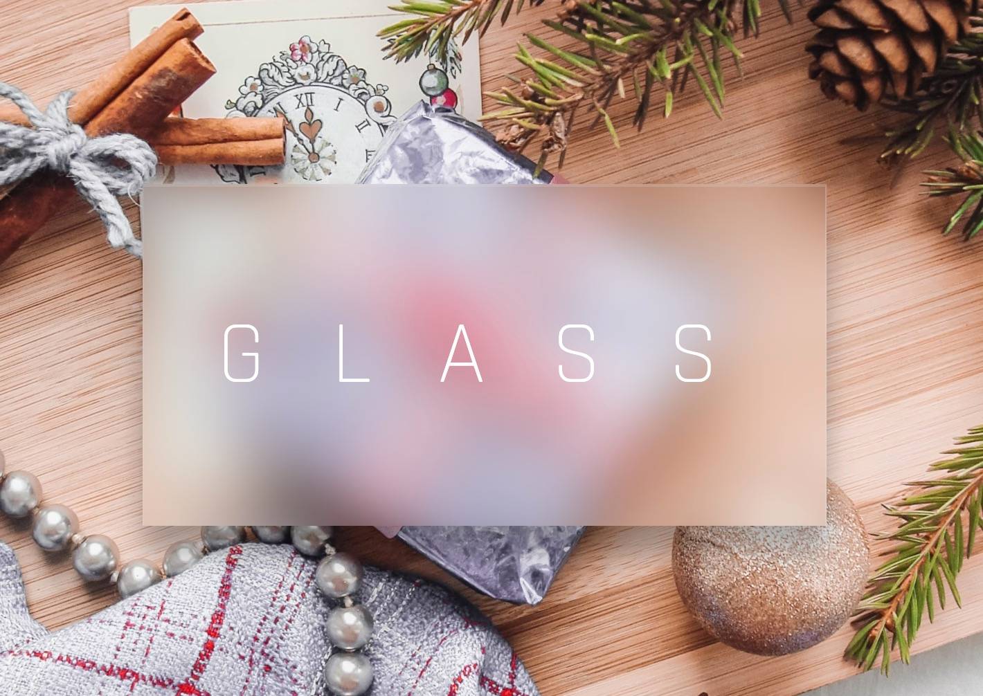
毛玻璃完成效果畫面如下:
參考來源:
https://developer.mozilla.org/en-US/docs/Web/CSS/filter
https://codepen.io/alphardex/pen/pooQMVp
https://codepen.io/AmJustSam/pen/ModORY

相關文章