css
animation
background
CSS Animation Background
2018/12/26 11:15:49
1
2136
CSS Animation Background
| 簡介 |
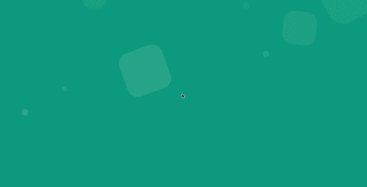
純CSS動態氣泡背景 |
| 作者 |
吳倩玟 |
純 CSS 的動態背景,只要 animation 屬性就可以完成,這次要呈現的動態效果是氣泡背景,
animation 用於設置六個動畫屬性:
- animation-name 設定選擇器的 keyframe 名稱
- animation-duration 設定完成動畫所花費的時間,以秒或毫秒計
- animation-timing-function 設定動畫的速度曲線
- animation-delay 設定在動畫開始之前的延遲
- animation-iteration-count 設定動畫播放的次數
- animation-direction 設定動畫輪流反向播放
在 html 建立 10 個氣泡 list 標籤:
<div class="wrap">
  <ul class="circles">
    <li></li>
    <li></li>
    <li></li>
    <li></li>
    <li></li>
    <li></li>
    <li></li>
    <li></li>
    <li></li>
    <li></li>
  </ul>
</div>
開始利用 css 來完成氣泡動態背景,
首先給網頁設定背景色 #009688
.wrap {
  background-color: #009688;
  width: 100%;
  height: 100vh;
}
設定氣泡的位置範圍:
.circles {
  position: absolute;
  top: 0;
  left: 0;
  width: 100%;
  height: 100%;
  overflow: hidden;
}
氣泡的樣式:
.circles li {
  position: absolute;
  display: block;
  list-style: none;
  width: 20px;
  height: 20px;
   /*氣泡預設大小*/
  background: rgba(255, 255, 255, 0.2);
   /*給氣泡20%的透明度*/
  animation: animate 25s linear infinite;
   /* animate = 動畫名稱 */
   /* 25s = 動畫時間25秒 */
   /* linear = 動畫開始至結束速度一致 */
   /* infinite = 動畫無限次播放 */
  bottom: -150px;
}
接下來給 10 個氣泡不同的位置、大小、延遲時間及移動速度:
.circles li:nth-child(1) {
  left: 25%;
  width: 80px;
  height: 80px;
  animation-delay: 0s;
}

.circles li:nth-child(2) {
  left: 10%;
  width: 20px;
  height: 20px;
  animation-delay: 2s;
  animation-duration: 12s;
}

.circles li:nth-child(3) {
  left: 70%;
  width: 20px;
  height: 20px;
  animation-delay: 4s;
}

.circles li:nth-child(4) {
  left: 40%;
  width: 60px;
  height: 60px;
  animation-delay: 0s;
  animation-duration: 18s;
}

.circles li:nth-child(5) {
  left: 65%;
  width: 20px;
  height: 20px;
  animation-delay: 0s;
}

.circles li:nth-child(6) {
  left: 75%;
  width: 110px;
  height: 110px;
  animation-delay: 3s;
}

.circles li:nth-child(7) {
  left: 35%;
  width: 150px;
  height: 150px;
  animation-delay: 7s;
}

.circles li:nth-child(8) {
  left: 50%;
  width: 25px;
  height: 25px;
  animation-delay: 15s;
  animation-duration: 45s;
}

.circles li:nth-child(9) {
  left: 20%;
  width: 15px;
  height: 15px;
  animation-delay: 2s;
  animation-duration: 35s;
}

.circles li:nth-child(10) {
  left: 85%;
  width: 150px;
  height: 150px;
  animation-delay: 0s;
  animation-duration: 11s;
}
最後在 keyframes 設定動畫規則:
@keyframes animate {
  0% {
    transform: translateY(0) rotate(0deg);
    /* translateY = Y軸位置 */
    /* rotate = 旋轉角度 */
    opacity: 1;
    /* 透明度的參數可設定0.0(透明) ~ 1.0  (不透明) */
    border-radius: 0;
    /* 圓角 */
  }

  100% {
    transform: translateY(-1000px) rotate(720deg);
    /* 氣泡由下往上移動至-1000px,旋轉720度 */
    opacity: 0;
    border-radius: 50%;
    /* 產生圓角 */
  }
}
純 CSS 的動態氣泡背景完成了!

相關文章