Visualisation of Associated Networks Using D3.js and neo4j
Visualization of Associated Networks Using D3.js and neo4j
Introduction
Network diagrams are very useful in visualizing store data, identify significant structures, and get a better understanding of relationships. Neo4j is a graph database platform that comes with a built in tool to build complex, sophisticated and customizable visualizations. However, in most cases, developers want to embed those visualizations in their websites. Neo4j provides a standard JavaScript driver implementation that lets you connect to a database via the bolt protocol, making it easy to send Cypher Queries from JavaScript code to the database.
However, this set up is not useful for sophisticated applications. In most cases, developers prefer using a third-party library to process data from neo4j and display network graphs in front-end. In this article we will use D3.js to create network graphs based on data from neo4j.
Case Study
In this article we use D3.js to create associated network graphs which show relationships between companies doing transactions with each other. In each use case, we will have the main company, which does trading with different companies. The companies being traded with are categorized into two; purchaser and distributor. The final result is as shown below;
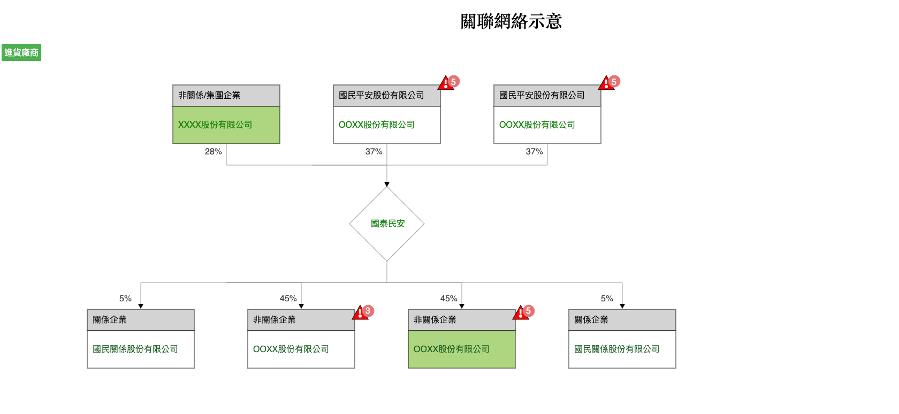
Figure 1.1
Implementation
To use D3.js, we import the script via the script tad of our html file;
<script src="https://d3js.org/d3.v5.min.js"></script>
The data from neo4j will come in the format show below. It's an array of objects containing the main company and all the companies that the main company does trabsanctions with, either a distributor or a purchase.
{
main_company: [{ name: " 國泰民安" }],
distributor: [
 {
        type: "關係企業",
        name: "國民關係股份有限公司",
        alertCode: 1,
        inLineCustomer: false,
        risk: false,
        percentange: "5%",
        personInCharge: "陳XX",
      },
      {
        type: "非關係企業",
        name: "OOXX股份有限公司",
        alertCode: 3,
        inLineCustomer: false,
        risk: true,
        percentange: "45%",
        personInCharge: "陳XX",
      },
      {
        type: "非關係企業",
        name: "OOXX股份有限公司",
        alertCode: 5,
        inLineCustomer: true,
        risk: true,
        percentange: "45%",
        personInCharge: "陳XX",
      },
      {
        type: "關係企業",
        name: "國民關係股份有限公司",
        alertCode: 1,
        inLineCustomer: false,
        risk: false,
        percentange: "5%",
        personInCharge: "陳XX",
      }
],
purchaser: [
      {
        type: "非關係/集團企業",
        name: "XXXX股份有限公司",
        inLineCustomer: true,
        risk: false,
        alertCode: 2,
        percentange: "28%",
        personInCharge: "陳XX",
      },
      {
        type: "國民平安股份有限公司",
        name: "OOXX股份有限公司",
        inLineCustomer: false,
        alertCode: 5,
        risk: true,
        percentange: "37%",
        personInCharge: "陳XX",
      },
      {
        type: "國民平安股份有限公司",
        name: "OOXX股份有限公司",
        inLineCustomer: false,
        alertCode: 5,
        risk: true,
        percentange: "37%",
        personInCharge: "陳XX",
      },
      {
        type: "國民平安股份有限公司",
        name: "OOXX股份有限公司",
        inLineCustomer: false,
        alertCode: 5,
        risk: true,
        percentange: "37%",
        personInCharge: "陳XX",
      },
      {
        type: "國民平安股份有限公司",
        name: "OOXX股份有限公司",
        inLineCustomer: true,
        alertCode: 5,
        risk: true,
        percentange: "45%",
        personInCharge: "陳XX",
      },

    ]
}
D3.js make use of scalable vector graphics (SVGs), HTML5 and CSS to make produce dynamic data visualizations in web browser. It is this low level nature that makes D3.js flexible and very customizable. To produce the network diagram shown in figure 1.1, we start with drawing the central node (main company) as show below;
let svg = d3
      .select(`.${container}`)
      .append("svg")
      .attr("width", this.mainCompany.width)
      .attr("height", this.mainCompany.height)
      .attr("transform", function (d, i) {
        return "translate(150,-30)";
      });

    let g = svg
      .selectAll("g")
      .data(data)
      .enter()
      .append("g")
      .attr("height", this.graph.height)
      .attr("width", this.graph.width)
      .attr("transform", function (d, i) {
        return "translate(70,110)";
      });
The above code makes a svg which contains the main company node. To achieve this, we do the the followig;
1. Use d3's select function to select the container of the svg
2. append a svg using the append function
3. apply attributes like width, height and transform.
To produce the rhombus shape, we use the radialine function;
var radialLineGenerator = d3.radialLine();
    var r1 = 70;
    var radialpoints = [
      [0, r1],
      [Math.PI * 0.5, r1],
      [Math.PI, r1],
      [Math.PI * 1.5, r1],
      [Math.PI * 2, r1],
    ];

    var radialLine = radialLineGenerator(radialpoints);

    g.append("path")
      .attr("class", "radial")
      .attr("d", radialLine)
      .attr("fill", "none")
      .attr("stroke", "#999");
This results to the main company node;

Then we apply the the text label, with the code below;
g.append("text")
      .attr("x", -30)
      .attr("y", 5)
      .text(function (d) {
        return ``;
      })
      .attr("font-family", "sans-serif")
      .attr("font-size", "16px")
      .attr("fill", "green")
      .attr("text-align", "center");
The final result is as shown below;

To produce a node of either a distributor or a purchaser we use the same method to append an svg to the distributor or purchaser div an then append a rectangle to that svg as shown below;
g.append("rect")
      .attr("width", this.companyTypeWidth)
      .attr("height", 40)
      .style("fill", "#D3D3D3")
      .style("stroke", "black")
      .attr("x", function (d, i) {
        return i * 300 + 400;
      })
      .attr("y", function (d, i) {
        return 40 + 200;
      });
Then we add the company name and styling to each company node;
// adding text for company name
    g.append("text")
      .attr("x", function (d, i) {
        return i * 300 + 410;
      })
      .attr("y", function (d, i) {
        return 40 + 280;
      })
      .text(function (d) {
        return `${d.name}`;
      })
      .attr("font-family", "sans-serif")
      .attr("font-size", "16px")
      .attr("fill", "#1b5e20 ")
      .attr("text-align", "center");
This result to the below node.

The last step is to add risk warning indicator in each company and the percentage sales ratio. The final netwoek graph looks as shown below;

Conlusion
In this article we demostrated how the library D3.js can be used to construct and visualize neo4j data and display network graphs in he browser.