How to draw a financial K chart with Bézier curve tool
如何利用 iOS 貝茲曲線自己畫線圖
How to draw a financial K chart with Bézier curve tool
在工作跟金融業扯上關係的情況下,總是有機會遇到要畫 K 線圖的需求。昕力資訊接了很多銀行系統的案子,大部份是做網路銀行的 App,但也是有機會遇到要畫圖的需求。例如台新銀行最近的改版就多了外匯走勢的頁面,如果有一天有個需求是 App 改為原生開發的大改版,就可以用到本文的知識。線圖只是個表面上複雜,導致每個工程師都想逃避,但實際上卻很簡單就能實現的功能。在這篇文章中,會分享線圖繪製的基本概念與基礎開發流程。
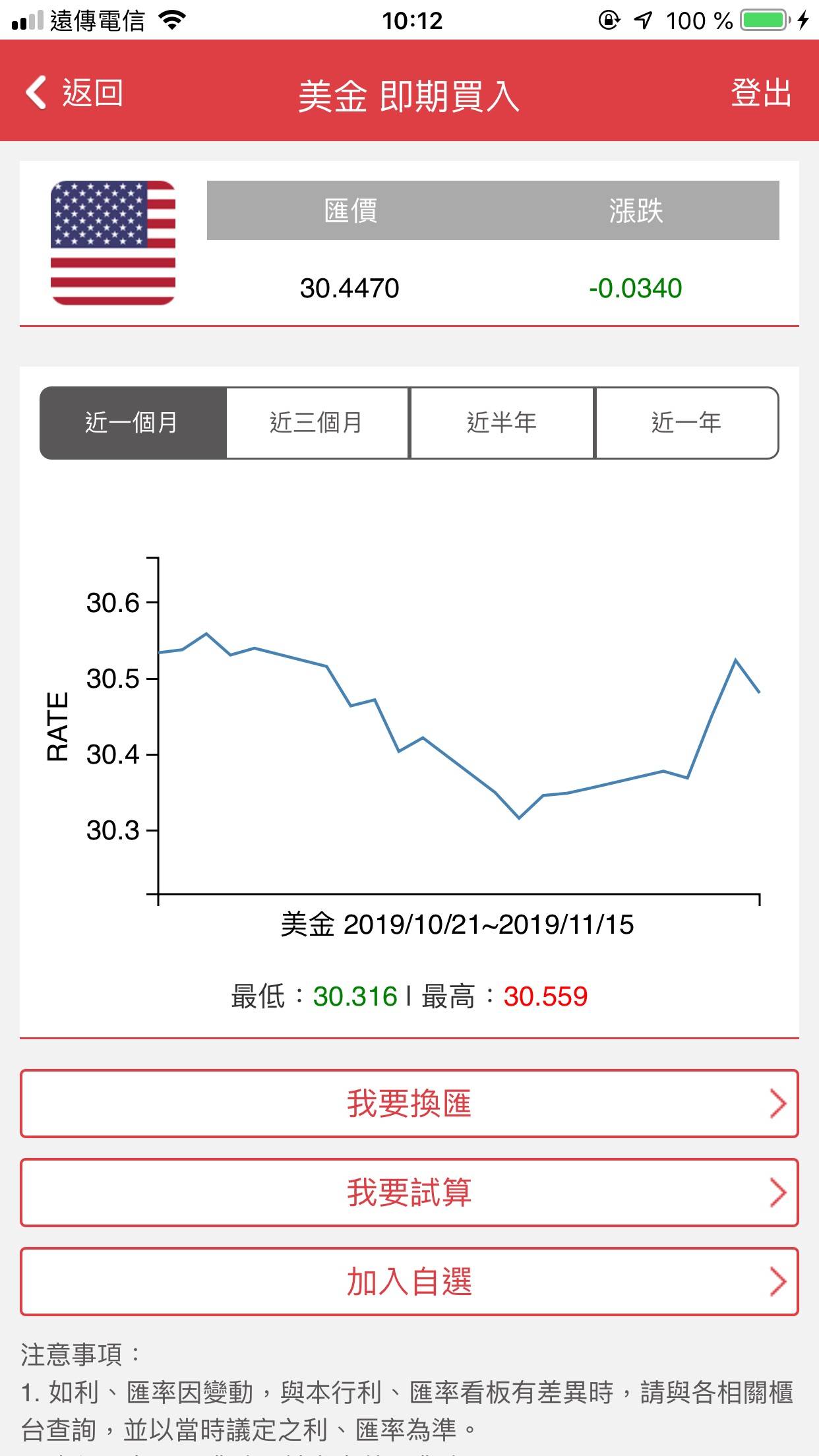
If you are doing a project which is for the financial industry, there is usually a K chart requirement. For instance, they add a new feature, forex rate page, in the recently release of TaiShin bank app. If in the future the client wanted to make their app with native code, you need the knowledge in this article for this page. K chart looks very complex so most of developers want to escape from that. But actually, this is easy to implement by self. This article will share the basic concept of chart drawing and the process of the implementation.
本文章內容如下:
- 線圖為什麼要自己畫
- 線圖頁各物件說明
- 畫圖流程與思路
- 後續作業
- 總結
Agenda:
- Why do we need to do the chart by self
- Instruction of the components in the chart
- The progress for making a chart
- Future task list
- Summary
本文章不會包含以下知識,避免焦點發散:
- 完整系統架構設計。實務上,整體的架構設計與業務需求有關。
- 完美解耦後做成套件上 CocoaPods。今次以概念教學院主,套件化的架構知識不在這次討論範圍。
- 額外細節需求的處理。會當後續練習作業方向提示。
- 單元 / 界面測試。要做到能自動化測試,會導致本篇主題完全偏去架構這個大議題而失焦,因此先不討論。
The follow contents are not included here to avoid loosing focus of drawing:
- System design. The architecture should depend on the business logic requirement.
- Perfectly decouple each component for creating a public shared library on CocoaPods. This article is for basic concept and tutorial only.
- Details implement for the future. These will be in the homework list.
- Unit / UI Test. We should have a good architecture design for that, but this time we are not talking about system architecture.
請先到以下網址下載範例程式。
Please download the sample code from the following link before you start the tutorial.
https://github.com/no134217728/KChartConceptiOSTaieph
一、線圖為什麼要自己畫
1. Why do we need to do the chart by self?
我以過來人的經驗,直接給答案:線圖程式就是要自己掌握。當遇到畫線圖時,不要指望網路上一堆第三方套件。Swift 版最多星星的套件是 danielgindi/Charts,這是個很優秀的套件,功能強大也畫得很漂亮。當然,各種 bugs 也很多。我有追蹤這個套件,信箱中每天都會收到大量問題修正或需求詢問的信。
I give the answer directly: The charts should be under your control. We always feel frustrate when we attempt to use a 3rd party kit to cope the chart. The most popular chart library in Swift on Github is danielgindi/Charts which is definitely an outstanding kit with powerful features, beautiful effect, and buggy. I am watching this project on Github and receive lots of mails about issues and wishes of features every day.
使用第三方套件一個很大的問題是無法很好的實現客製化要求。被分享出來的套件是要給大家用的,所以會盡可能的向大眾的需求靠攏,不過我們做自己在開發時,會遇到很多線圖客製化細節需求,但受限於套件的架構,我們很難調到完美符合客戶的要求。就算自認功力足以進入原始檔修改,也是要花費大量時間先研究這複雜系統的架構,但花了那麼大的力氣,也不保證能修出符合要求的結果。
It is a difficult situation that you cannot perfectly or very hard to customise the chart to meet the user’s requirement if you are using a free shared 3rd party. A public 3rd party kit is made for general purpose, so the authors will try to make it be in common use. But clients always request customised details in features and UI, and it is very hard to meet their very details requirement duo to the limit of the kit. Even if you think you have the ability to modify the source code, it still takes too much time to study this complex system architecture. You cannot ensure that after taking a lot of effort, the final outcome can satisfy your customer.
另外,因為套件是要給大家用的,所以作者會在套件中加入所有可能用到的功能。而如果今天的需求只是單純的 K 線與技術線,那套件裡的長條圖、圓餅圖、折線圖…等等功能是可以不需要的。明明一堆沒必要的功能,但為了符合通用套件的參數要求,使用時反而要多設定一堆複雜的參數。為了研究這些初始化參數,也要花不少時間。
In addition, this is a common use kit, so authors implement as more chart functions as they can. If you just want a simple candle chart and technical indicator lines, it is not necessary to use a kit with bar chart, pie chart, line chart, histogram.... Because of the powerful features of the kit, you usually need to setup too many unnecessary parameters. That wastes your time.
受限於套件現成的架構,如果自己有想要擴充的功能,一樣要花費力氣去研究怎麼做。
In the other hand, you have to spend much time to study how to extend a new feature you require on the current complex architecture.
每個報價商提供的原始資料格式不見得都一樣。基本上資料永遠都是最高、最低、開盤、收盤、時間五要素,不過有可能還是要再將該 model 轉換成符合套件要用的格式。自己開發時,針對需求直接設計輸入格式即可。
Futuremore, the data model from your server is not as same as the kit's format. Although the basic data structure is a dictionary with high, low, open, close and timestamp, you still need to convert the original data to the format for this kit. If you make your own chart system, you can directly design your data structure and interface.
有時候只是簡單的需求,但為了迎合套件的介面,還要再花功夫額外處理資料。
And sometime you need to meet the kit’s interface, thus you have to do other things to process the original data. Even if that is just a very simple requirement.
自做線圖也還有以下好處:
There are other benefits that you know how to draw the chart:
在教新人、下一間面試等報告類的場合可以裝逼。在非金融業講時,外行人會以為做這個很屌;在金融業的話,其實這是基本中的基本,沒畫過線圖,很難讓人信服你真的在金融業裡做的開發是做重要的部份。
On the occasion of presentation, such as teaching a junior or on a job interview, you can swank. On a non financial situation, an outsider will think this is an awesome achievement; in a financial industry, this is a very basic skill if you are a frontend developer in this field. If you don’t have an experience in finance chart drawing, how to convince the supervisor that you were a key man in your project?
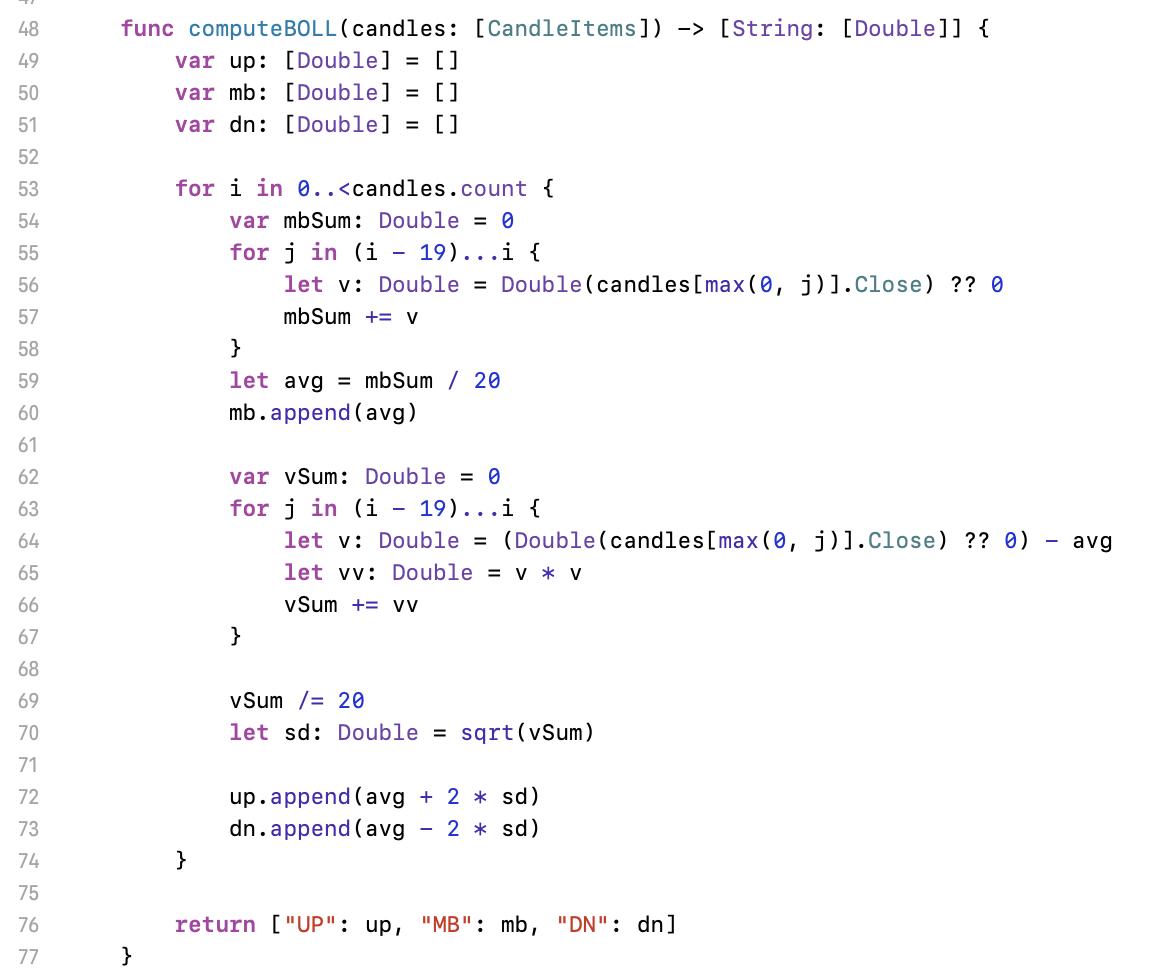
除非本來工作就是在寫套件給內部使用,要不然只要針對需求所需功能開發即可,節省開發時間。
Besides that, it’s saving time to develop required features only, unless your task is to make a common framework for your company.
自製的東西完全可控、可掌握。
Moreover, you can fully control your code, features, bugs.
直接針對自家的資料來源做 model,省掉轉換。
And the last, design your model following the backend return. No need to do convert.
二、線圖頁各物件說明
2. Instruction of the components in the chart.
所需原始資料:我們只需要時間、開盤、收盤、最高與最低等五個欄位的資料。有這些資料就可以畫出所有的圖。需要有個 API 直接提供這些資料,或自己要想辨法整理成這樣的格式。
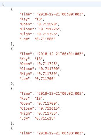
Required original data: We only need timestamp, open, close, high, low. We can draw all types of finance chart with these five figures. It’s better that you can get the data directly from your backend server, or you have to arrange your original data to these five fields.
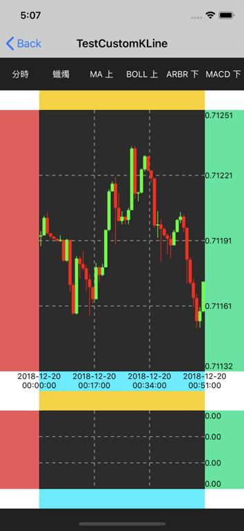
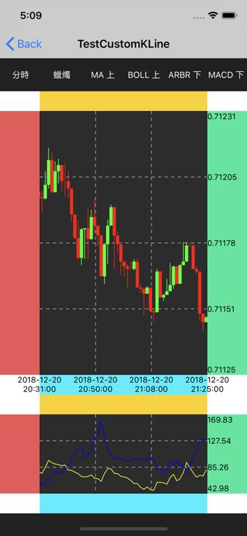
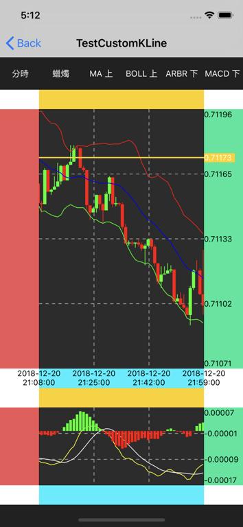
下圖為範例程式執行結果。內含元素:
底格及內部虛線:看大部份線圖的網格都是虛線呈現,所以畫底格的程式也包含了畫虛線。
The above image shows the final of this tutorial. Elements:
Grid with dotted lines: Most of the candle chart are with dotted lines grid, so there is the code with dotted line implement in this demo.
標籤:為方便辨識,範例中放上色塊。就是主圖的上下左右留空的色塊。通常用到右與下兩個部份,在比較複雜的需求時可能會需要左與上的標籤。在範例中,未使用的邊界可以設定關掉,這樣主圖的空間就能大一點。
Labels: For a better recognise, I add background colour to each labels’ area. The four colour areas around the main chart are for labels. We usually use the right side and the bottom side. In a complex case, the left side and top side will be required. In this demo, you can disable an unused label area to let the main chart larger.
區間最大最小值:這邊是需要依呈現的範圍來決定,需要做一些計算。
Max and min: Depends on the scope of displayed candles. Some calculation is needed.
座標系統轉換:核心概念,但其實只有一行計算式。
Coordinate converter: This is the core concept, but actually it’s only one line code.
蠟燭圖、技術線、柱狀圖:主要的圖。
Candle chart, technical indicator, histogram: The main drawing.
縮放:通常會被要求開發的功能。
Pinch: Usually be asked to implement.
畫面上的各個元件區塊說明:
Introduction of each area
色塊區:放標籤的地方,要能設定成隱藏。
Colour area: For labels. That should be hidden allowed.
主圖內的線:通常是虛線。設計最好要能調整行、列數。
Line in the main chart: It’s usually dotted. It’s recommended that number of horizontal line and vertical line can be set.
上半部線圖:K 線圖及部份技術線。例如均價線 MA、布林通道 BOLL。
Upper chart: Candle chart and some of technical indicator. For example, MA, BOLL….
下半部線圖:技術指標。例如 MACD、RSI…等。
Lower chart: Technical indicator. For example, MACD, RSI….
三、畫圖流程與思路
3. The progress for making a chart
先繪圖底格與內部虛線,成果如上圖。請將範例切換至 commit c3ffbf6,可以直接執行。主要的程式說明如下(主要程式都在 ChartViewController.swift 裡):
Firstly, draw the grid and inner dotted lines. Please refer to the above image. Checkout to commit c3ffbf6, and this can run directly. Below is the description of the code. (The code is in ChartViewController.swift. )
105 行呼叫的是上半部主圖的底格
Line 105 calls the abstracted function to draw the grid.
106 行是下半部技術圖的底格。兩者的基本邏輯是一樣的。輸入參數是圖面上橫線與直線的數量(不包含邊框)。
Line 106 is the method for technical indicator grid. These two are same logic. The inputs are for counts of horizontal and vertical lines. ( The counts does not include the border. )
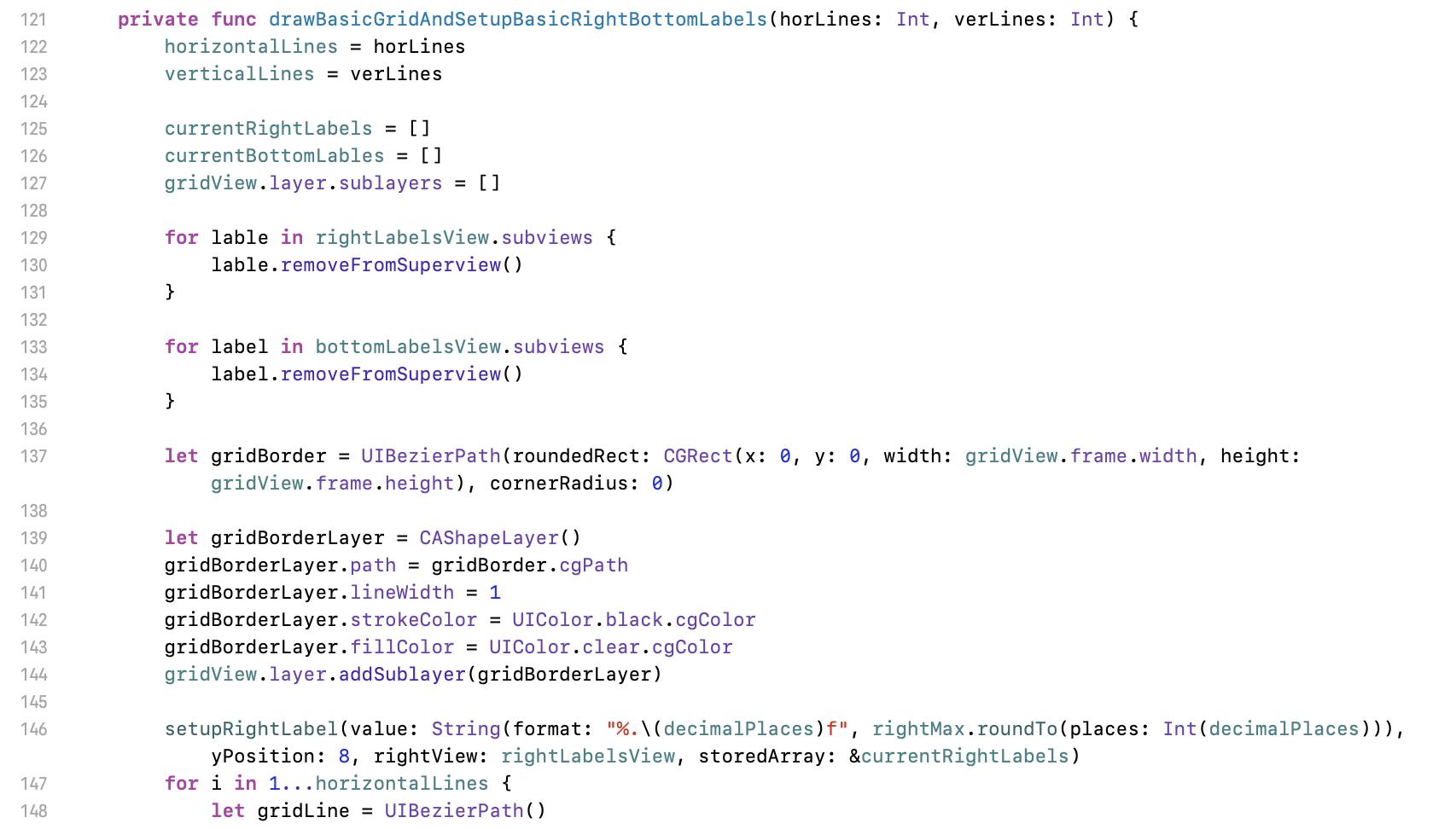
125 至 135 行是右與下的 Labels。因網格與 Labels 配置是完全相關的,我在範例中是混寫在一起。如果你有架構潔癖的話,這是一個可以重構的點。但今天是在講線圖概念,為了讓程式更簡化,先不討論各種架構方面的問題。
Line 125 to 135 are for right, bottom labels’ setting. I mixed these two pieces of code together because the configuration of labels relates to the grid’s setting. If you really adhere to clean code, here is one of the code that can be refactor. But today we should focus on the chart concept. To simplify our demo, there is no architecture topic in this article.
137 行這邊就是畫外框,一般貝茲曲線操作而已。
Line 137 scope is basic of Bézier curve drawing.
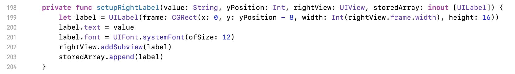
先跳到 198 行抽象化出來的右標籤設置方法。輸入參數為數值(value)、自己算出來的 y 座標位置(yPosition)、這些 Labels 放在哪(rightView)與要操作哪些 Labels 陣列(storeArray)。用 inout 的原因是因為要將操作的結果回存到那堆 Labels 裡。
Let we move to line 198 first. Here is an abstracted function for setup right labels. Input parameters are value (value), calculated y position (yPosition), where for the labels (rightView), and the array for labels (storeArray). Modifier inout is for to update the inputed source.
接下來看畫圖。
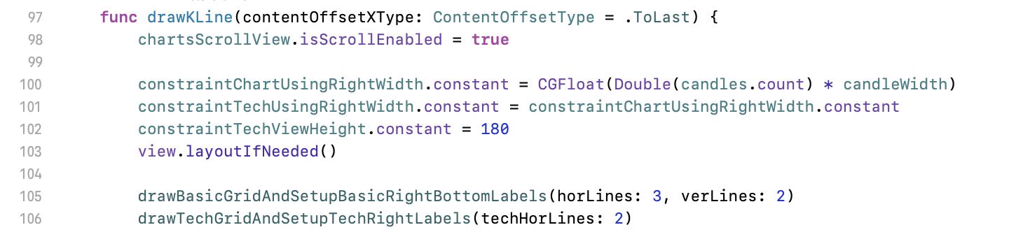
And then for the drawing.
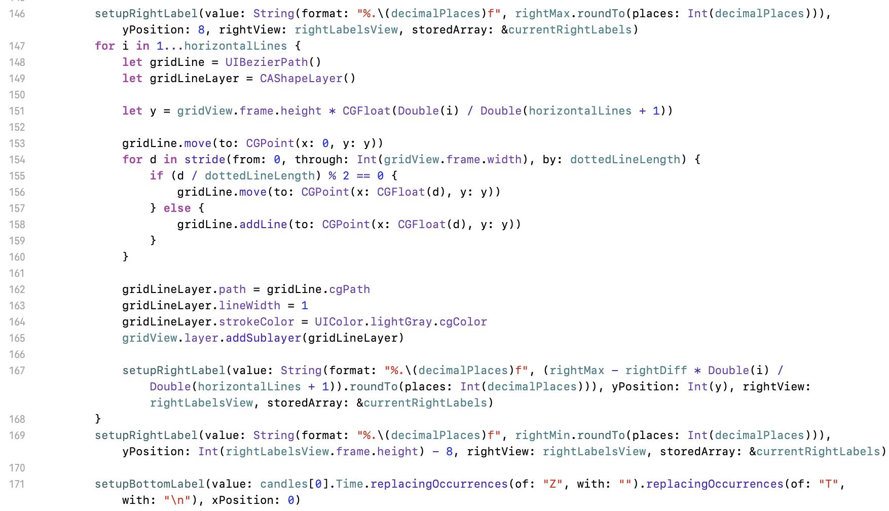
146 與 169 行是最上面與最下面的 Label,因 y 座標有其他調整,所以就獨立操作。
Line 146 and 169 are for the first and the last label. Because their y need to be adjusted, we cannot place them in the for loop scope.
147 行開始的迴圈就是主要畫格線之處。
Line 147 is the main scope for the drawing.
148 行與 149 為貝茲曲線基本要素。
Line 148 and 149 is to initialise Bézier curve.
151 行是計算 y 坐標,也就是這條橫線要畫在哪,及右邊 label 對應的位置。這個公式就是依高度比例繪製:圖的總高度 * 位置比例(第幾條線 / 橫線數量 + 1)。
Line 151 is to calculate coordinate y, which means the position of the line and the corresponding label. It’s the proportion of the total height: total height of the chart * proportion of the position (number of lines / count of horizontal line + 1).
153 行貝茲曲線基本操作:將畫筆移到起始點。
Line 153 is Bézier curve basic operation - move our pen to the point (Here is for starting).
154 行開始的迴圈。stride 那段是 swift 版相當於傳統程式 for ( d = 0; i < 畫面寬; d = d + dottedLineLength 區間 ) 用法。圈迴內依照要畫線時走158 行;不要畫線時走 156 行,以達到畫虛線的目的。
Line 154 starts the drawing scope. Syntax stride is Swift loop setting, which is like for ( d = 0; I < screen width; d = d + dottedLineLength) in other traditional programming language. According to the condition, go line 158 for drawing; go line 156 without drawing. Then our dotted line is finished.
162 ~ 165 行是將路線繪出。
Line 162 to 165 is to draw the line with Bézier curve basic method.
167 行是設定 label。值的計算公式義意為:標籤最大值 - 最大與最小差值 * 位置比例(第幾條線 / 橫線數量 + 1)。最後的 roundTo 與畫圖無關,該方法是我自己加的 double extension,取到小數第幾位數的功能而已,與今天主題無關,無需深究。
Line 167 setups the label. The meaning of the formula is: Max value of the labels - Difference of the max and min value * proportion of y position(i). Ignore the following roundTo extension method. This is for setting the number of decimal because of requirement and it does not relate to the topic of drawing. No need to focus on it.
(i) number of the line / count of horizontal lines + 1
再往下的程式則是類似邏輯來畫垂直線,但是改用設定底部 labels 及計算 x 坐標而已。可忽略程式中 replacingOccurrences 方法,這只是為了處理我範例原始資料的一些雜值。
Continue to read the demo code, you can find a piece of code that is similar to the code above. Here is the same logic but for bottom labels and x coordinate. Please ignore replacingOccurrences calling for trimming unnecessary data in time stamp string.
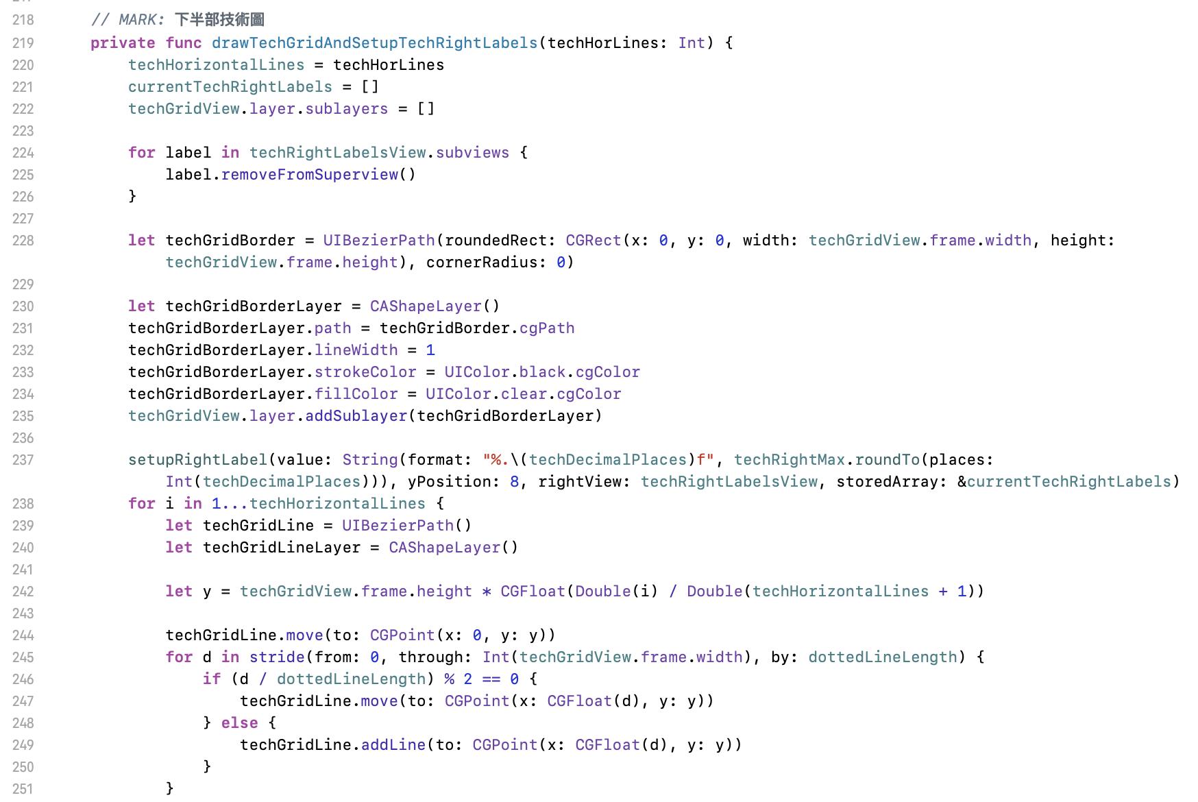
再往下到 219 行看到的 drawTechGridAndSetupTechRightLabels 方法,是畫技術圖底網的方法。核心邏輯與上面相同。
Then go to line 219 for method drawTechGridAndSetupTechRightLabels. This is for the grid of technical indicator. Same logic as the grid of main chart.
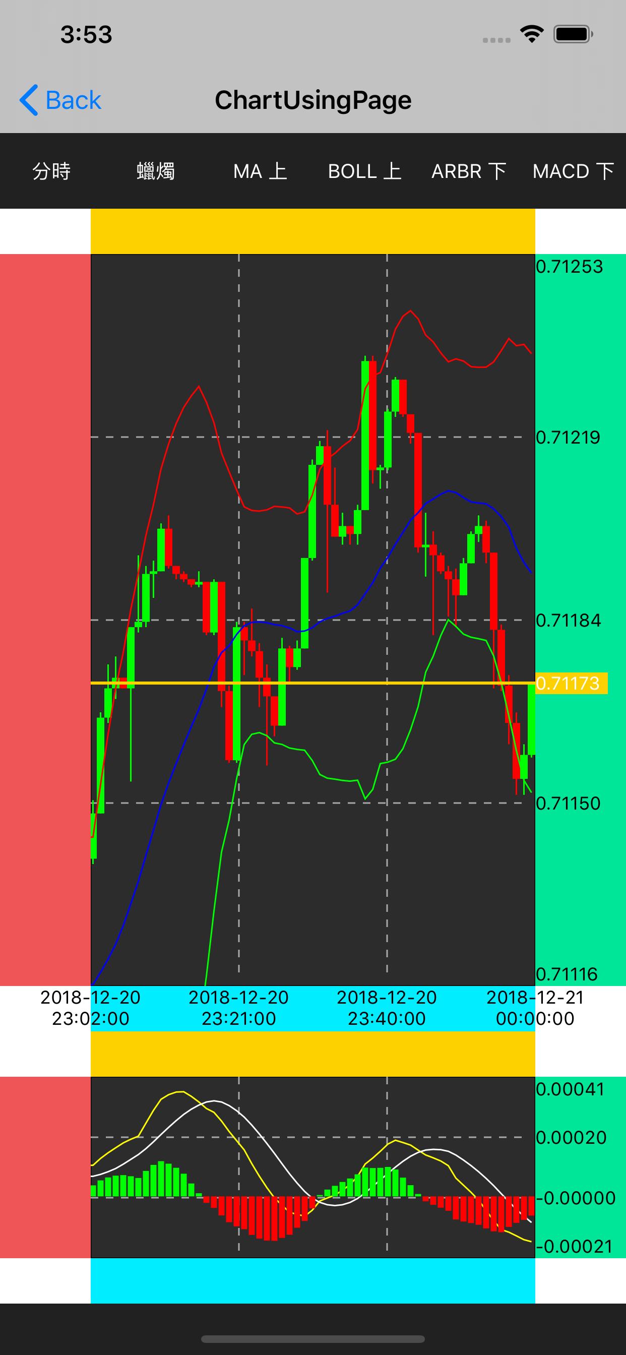
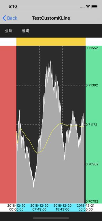
接下來我們將 commit 切換到 c384acc。走到這邊的結果如上圖,我們已經畫好蠟燭圖。這段會是整個流程的核心,最重要的是圖的坐標轉換,但其實也是簡單的一行程式而已:計算比例後放到正確的 y 位置。
Then we checkout the commit c384acc. The result is as the above image. We have finished the candle chart. This section is the core of the concept. The most important thing is to convert the coordinate, but this is just one line code: Compute the proportion then place it to the correct y position.
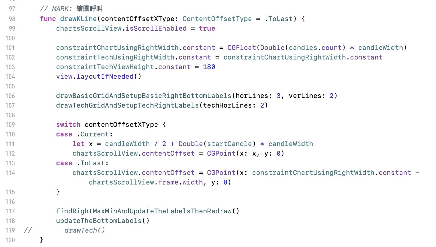
先看主要繪圖的程式。這個階段要執行的是第 117 與 118 行:找出區間範圍後重繪、更新底部標籤。
Let us see the main drawing code. We are executing line 117 and 118 for finding the range of displayed candles then redraw, update the bottom labels.
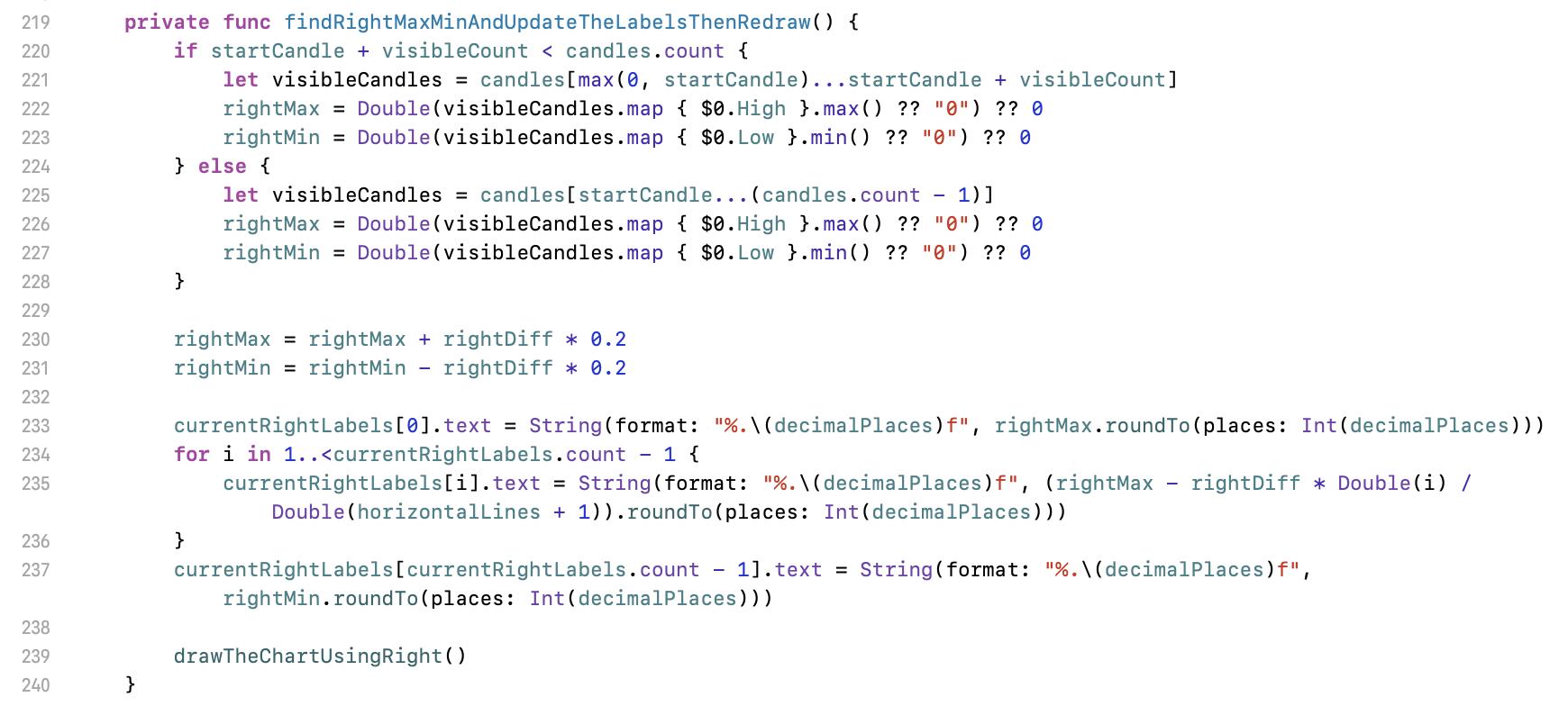
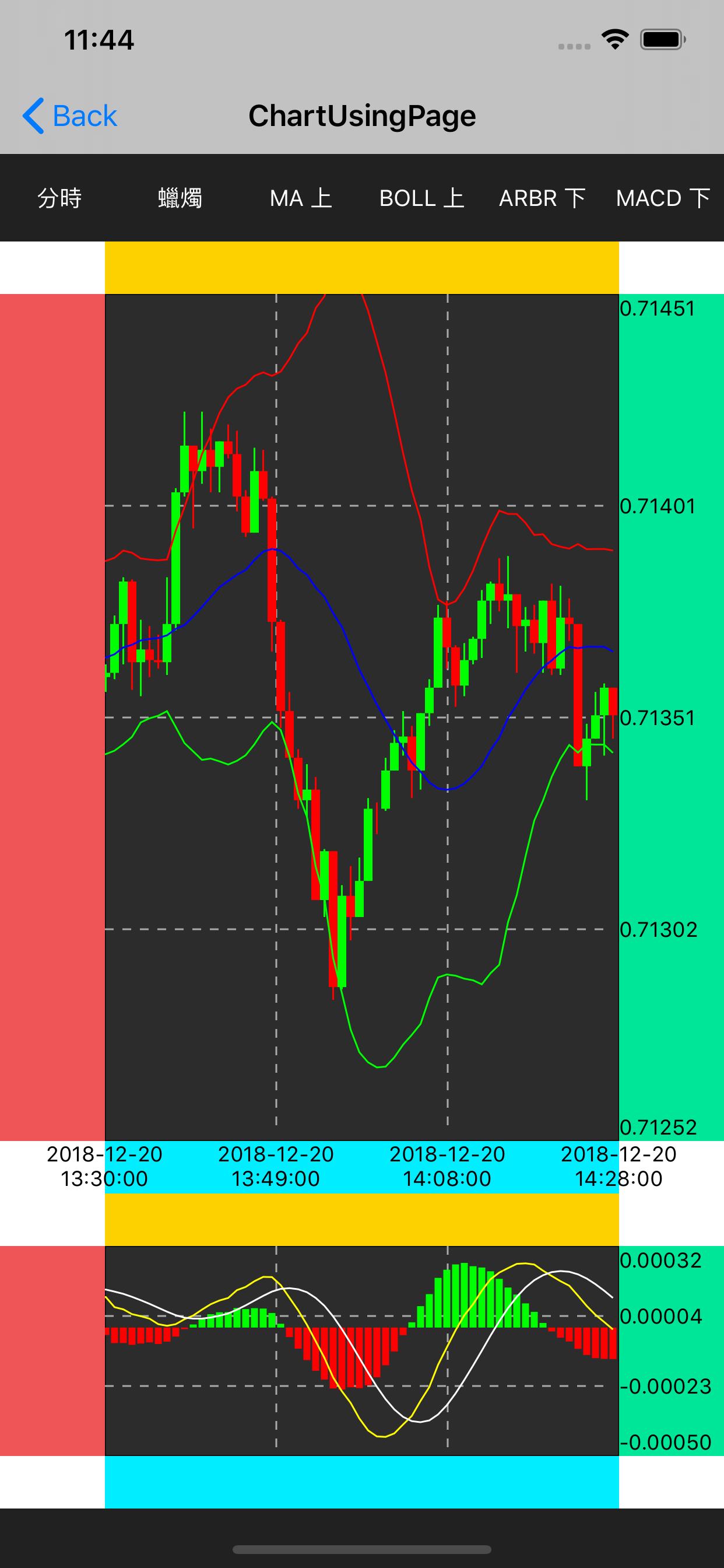
220 行的判斷式是在找出顯示區間範圍的最大與最小值。這個最大最小值必需要是從顯示的區間找,而不是所有資料的。如果拿所有資料來設最大最小,且該份資料的行情是波動較大時,就會發生如右圖的狀況,這個 K 線變得非常小且失去意義。
Line 220 if scope is to find the max and min value in the range of displayed candles. You have to find the max/min value in the area of the showing candles instead full range of candles data because the max/min value from a high fluctuation full dataset leads a meaningless chart with all very small candles likes the right image.
230 與 231 行的目的是要讓上下留一些空白,依需求設定。如果沒有設定,線圖的最高與最低就會剛好在畫面上頂天立地。範例中我留 0.2 的倍率,就是如右圖圈起處的空間。最大或最小的加減比率是要以原始最大最小的差距再乘上所需比率,程式中的 rightDiff = rightMax - rightMin。
Line 230 and 231 is to remain a blank area on the chart. It depends on the requirement. If there is no blank area setting, the result look ugly because the highest value reaches the top of the chart and the lowest value sticks the bottom of the chart. I set 0.2x in the demo code results in the blank at the places of red circle in the right image. The proportion of max/min for extra space should be calculated by the difference of original max and original min then multiply the proportion you want. In the demo code, please find rightDiff = rightMax - rightMin.
233 行開始這一段是將數值套入 labels。有新的最大與最小值後,畫面中間每條虛線的值就是依比例計算出來而已。由上而下來看,就是用最大值減去差異值在畫面上的比例。例如在有三條橫線的設定下,第一條橫虛線的值就是最大值 - 差異的 1/4;第二條是最大值 - 差異的 2/4。
Line 233 is for adopting the values to the corresponding labels. After we have new max and min values, the value for each dotted line is computed with the proportion of the position. From top to down, use the maximum value to subtract the proportion of diff of the chart. For example, in case of 3 horizontal, the value of the first dotted line is maximum - 1/4 of diff; the value of the second one is maximum - 2/4 of diff.
239 行為畫一根蠟燭的呼叫。
Line 239 is to call the method for drawing a candle.
這個方法命名後綴為 UsingRight 是因為要畫的東西坐標參考為右邊的 labels。這個迴圈是跑畫面上可見的那些蠟燭。程式中看到一些由 max(,) 或 min(,) 包起來的數字,只是用比較簡易的寫法來防止超出範圍而已。
The suffix UsingRight in the function name means the reference coordinate is using right labels. We draw all the visible candles on the screen in this loop. Some max(,) and min(,) are for avoiding out of range issue.
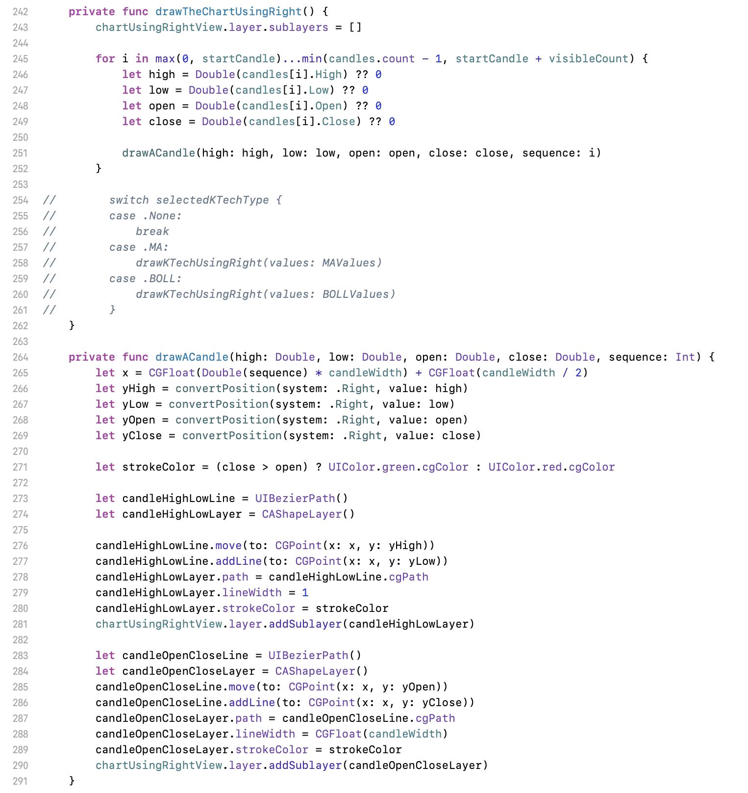
251 行的繪圖程式如下。跟 370 行的核心程式(座標轉換)一起看。
Line 251 for drawing. Following line 370 for coordinate convert.
265 行,x 坐標。
Line 265 is for x position.
266 至 269 行,將高底開關四個原始數據轉成畫面座標,使用右邊 labels 為參考。
Line 266 to 269 is to convert high, low, open, close figures to y position by using right labels for reference.
271 行,如為上漲(收盤大於開盤),畫綠色。但在亞洲,上漲時為紅色。
Line 271, if the price goes up ( close is higher than open ), use green color. But in Asia, draw red in this case.
273 行區塊,先將畫筆移至(move)高位 yHigh,然後畫圖(addLine)至低位 yLow。
Line 273, move the pen to yHigh then draw (addLine) to yLow.
283 行區塊,先將畫筆移至(move)開盤 yOpen,然後畫圖(addLine)至收盤 yClose。
Line 283 scope, move the pen to yOpen, then draw (addLine) to yClose.
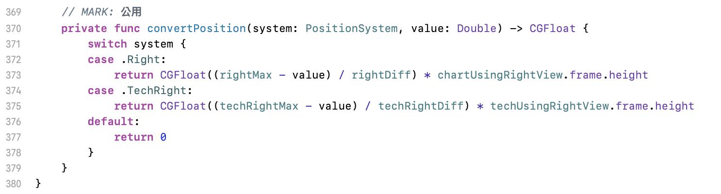
座標轉換的部份,以 373 行為例解說。這邊的 value 是原始數值,要算出這個數值等於畫面上哪個高度,也就是 y 座標。公式是:[ ( 畫面的最大值 - 原始數值 ) / 最大最小差異值 ] * 畫面高度,這個的意思就是要找出那個數值是在畫面的哪個比例位置。公式裡中括號裡面計算的就是所要的比例。
I explain coordinate convert with line 373. The value is the original data. We have to get its y position. The formula is [(max of the chart - original value) / diff of max and min] * chart height, which means to find the position on the proportion of the chart. The proportion is from the formula in [ ].
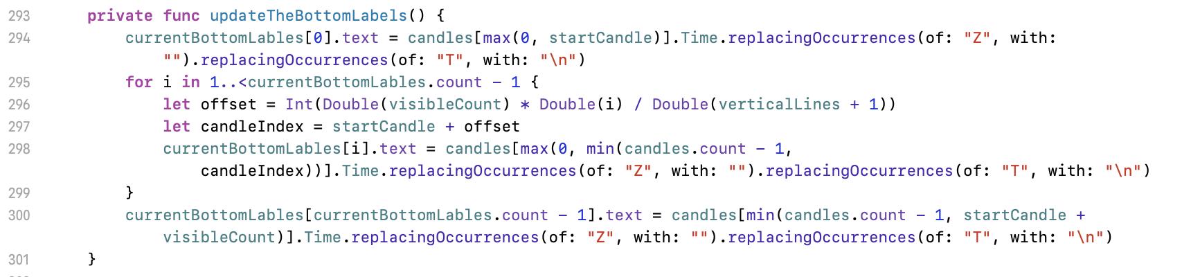
最後來看底部標籤的更新。這部份很單純,就是依比例取得資料而已。範例程式中有三條直線,所以第一條線的時間標籤就是要用陣列中,第(開始 + 可見數 * 1/4)筆的資料;第二條件以此類推,是(開始 + 可見數 * 2/4)筆的資料。程式中的 replacingOccurrences 可忽略,這只是我在處理原始資料的雜質而已。
The last task is to update the labels on the bottom. The concept is simple; just find the data in the dataset with required proportion. We have 3 vertical lines in this demo code, so the time stamp value of first vertical line should be the data in the array, which index is ( start index + visible count * 1/4 ); the second is ( start index + visible count * 2/4). Please ignore replacingOccurrences in the code.
現在進入技術指標的部份。請將 commit 切換至 7112efe。以畫 ARBR 線為例。
Then move to the technical indicator. Please checkout commit 7112efe. The example is ARBR.
計算公式放在 ChartManager 裡,各公式細節不在此討論。但在開發的時候,請自己依該技術圖的定義自己寫公式,這不是太難的事,絕對比自己想上網找現成的還快,而且自己做的東西自己才能掌握。
The formulas are in ChartManager.swift. No details discuss here. When you develop, please write the formula code yourself. This is not very hard and definitely less time consuming compare to search for a ready-made result. And you can only control the code that all made by you.
在寫技術指標計算時,會發現演算結構差不多都像是上面這個樣子。其實東西很簡單,就是一堆迴圈在跑而已,要深度思考的東西不多,整體實作的難度比大學時期的演算法課還低。所設計的資料格式為字典 [String: [Double 陣列]],這是為了多條線的技術線圖。
When you are writing the code for technical indicators, you will find the algorithm are almost the same structure. They are just a lot of loop and nothing is need to think deeply. The difficulty is lower than the homework in university. I use a dictionary [String: [Double array]] for multi lines indicator.
畫技術指標時也一樣,要先找出標籤的最大值與最小值,再依需求或美觀,給上下留些白邊。而技術指標常常是由多條線所組成,所以在找最大最小時,要把所有的線都考慮進去。
It’s the same logic when drawing a technical indicator. Find the max and min, then add blank for top and bottom. Some technical indicators have multi lines so you should consider all lines for finding the max and min.
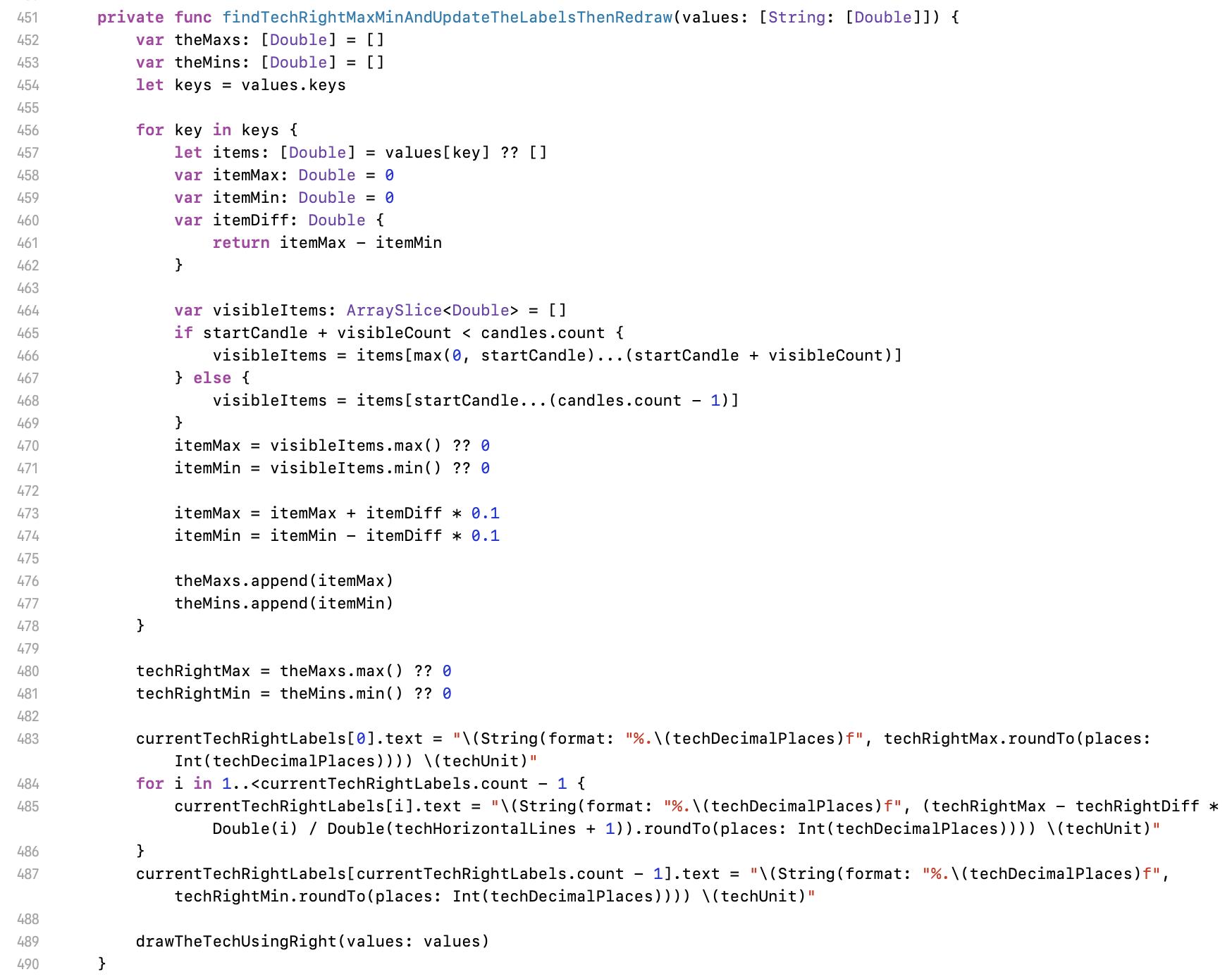
452 行這邊,宣告最大與最小值,但是個陣列。
Line 452 to declare an array for finding the max/min.
456 行的迴圈,把所有技術指標的值都找過。把各指標的最大與最小都找出來並存到剛才宣告的陣列裡,480 行再從這組陣列找一次最大與最小。
Line 456 for loop scope, to search all the value of technical lines for finding the max/min of each line then save to the array. Then line 480 finds the final max/min from this array.
483 行開始的 labels 值,與畫 K 線圖時一樣的方法,找出各橫線所代表的數值。
Line 483 is same as drawing K chart for labels. To find the value of each horizontal line.
489 行開始畫圖。
Line 489 to draw.
技術指標與 K 線圖不一樣的是,K 線圖是每筆資料畫一條件,技術指標是把每筆資料連起來。在這個方法中,把指標的資料傳進來。
A thing is different from drawing K chart. In case of drawing K chart, we draw each candle separately. In case of drawing technical indicator, we connect all point to a line.
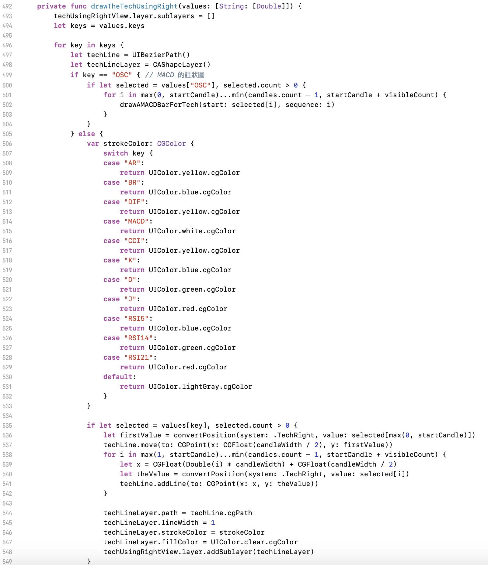
496 行這個迴圈是在處理多線條的技術指標。
Line 496 loop is for multi lines indicator.
497 行為貝茲曲線基本初始工作。
Line 497 is to initial Bézier curve.
499 行為 MACD 柱狀圖,在此先略過。
Line 499 is for MACD histogram. I will discuss later.
506 行設定線條顏色,依照需求配置。
Line 506 is to setup the colour of the line. Please refer to the requirement.
536 行開始畫圖。第一個值的座標轉換後,於 537 行將畫筆移至該位置。
Line 536, start to draw. Convert the first value then move the pen to the position at line 537.
538 行的迴圈,是把每一個點進行座標轉換。注意第 541 行,這邊用的都是 addLine,把線畫過去。
Line 538 loop is to convert all value to the coordinate. At line 541, all behaviours are addLine for drawing.
544 行開始為設定此線條的參數等,最後加到畫面上。
Line 544 is the Bézier curve setting for this line.
547 行把填滿設定時透明,不需要把線的節點連起來變成色塊。
Line 547 is to set fill colour transparent because we need the line only.
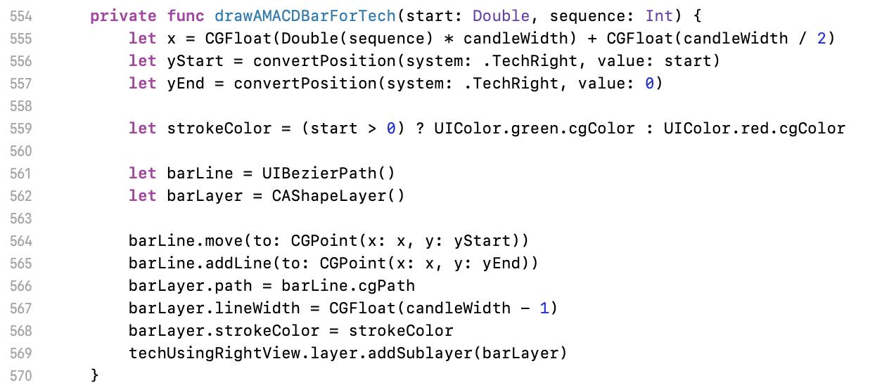
最後補充一下 MACD 柱狀圖。這個圖的結束點都是在 0 的位置,所以獨立出自己的方法。一樣的邏輯,y 的開始與結束值都要丟去座標轉換的方法丟得畫面座標,再於 564 與 565 行將圖畫出。
For MACD histogram, the end point of each line is 0. This is different from others so do it independently. The logic is still same - convert the value to y position, then draw it at line 564, 565.
下一個要介紹分時圖。對交易者來說,分時圖是很重要的參考資料,所以開發分時圖的需求基本上應該都是會有的。此時將 commit 切換到 d8150d3。如下面的範例圖片,分時圖通常會是滿版需求,所以要調整畫面配置。但這不應影響繪圖過程,在範例程式中,只是單純的調了 constraintTechViewHeight 值來做到隱藏與開啟的目的,其餘畫面的適配都只是 autolayout 實現的而已。
Next part is about mountain chart. This chart is very important for traders, so this is undoubtedly listed in the requirement. Please checkout to commit d8150d3. As the below image, we usually need a full screen mountain chart. In this demo, I just change the value of constraintTechViewHeight 0 to hide the technical indicator. If your autolayout setting are all correct, the screen will automatically perform as you expect.
這邊簡單的介紹分時圖的配置。此為範例程式的說明,實際使用時依照業務需求開發。
Here is the configuration of mountain chart. The instruction is for the demo code. Actually your config should depend on the requirement.
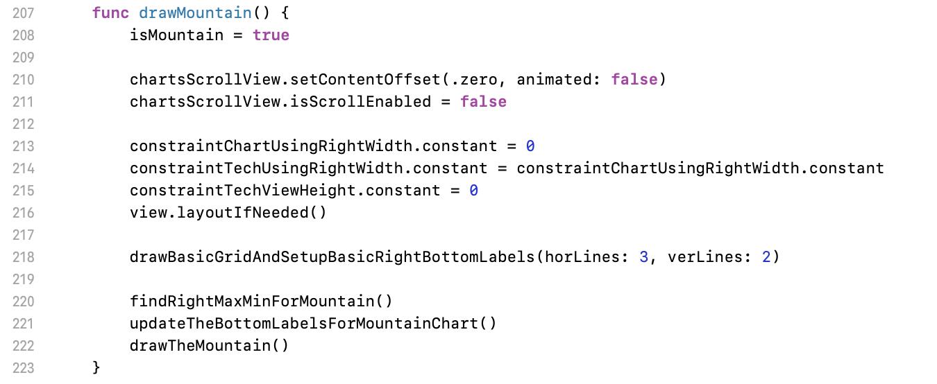
210 行這邊將 scroll 關掉,因分時圖不需要捲動。
Line 210 to disable scroll. No need to scroll for mountain chart.
213 行調整畫面配置相關約束。
Line 213 to setup constraints for views.
218 行畫網底。
Line 218 for the grid.
220 行開始執行繪圖。一樣先找出最大最小值,設定底部 labels,最後繪製主圖。前兩者的邏輯與其他作業都差不多,就不再多做說明。
Line 220 to start drawing. Find the min/max, setup bottom labels, then draw the main. Same logic as the other chart.
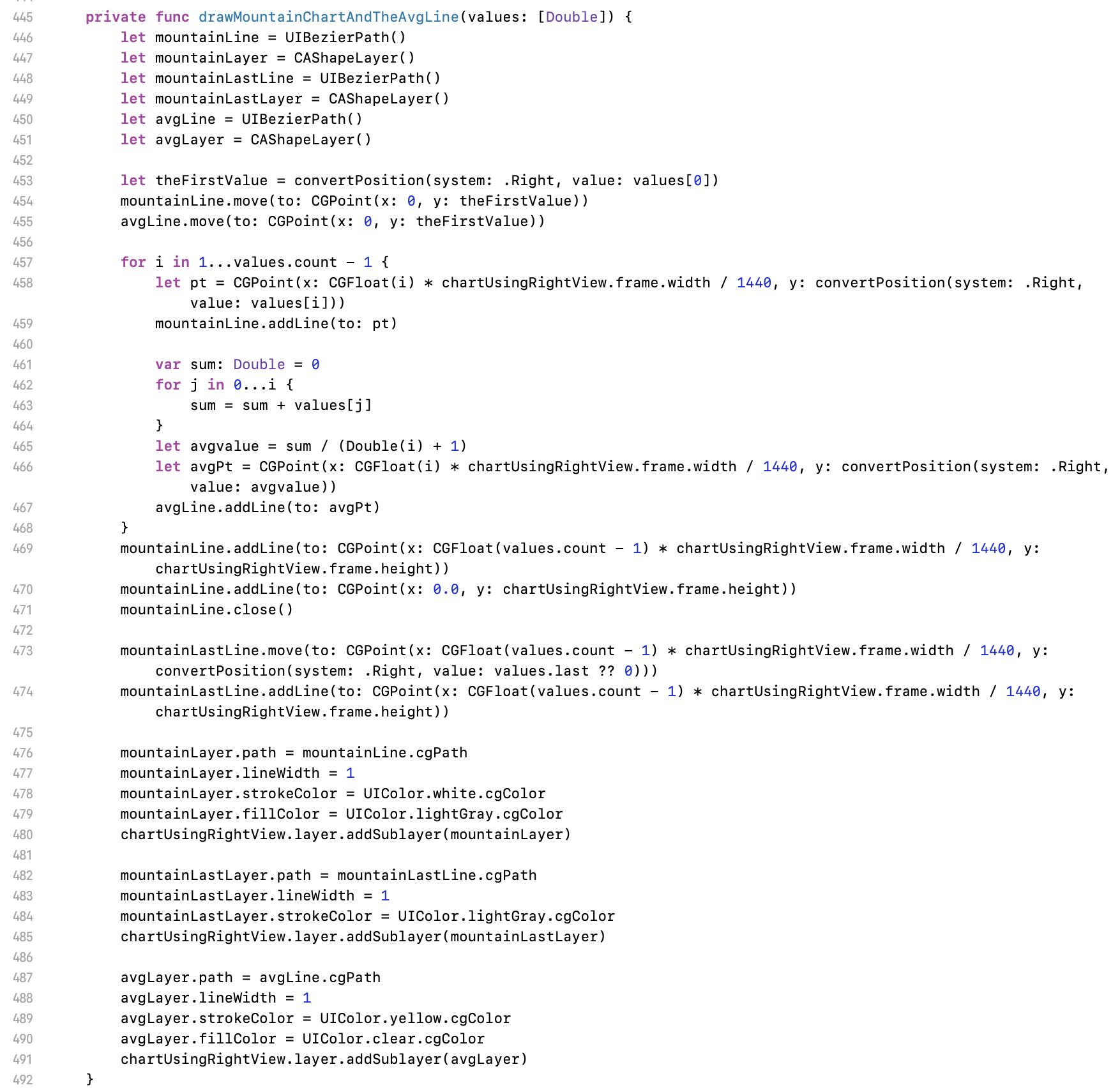
458 行這邊會看到魔法數字。分時圖的寬度一定是 1440 筆資料,因為一天有 1440 分鐘。如果使用者是中午進來看圖,這座山就只會畫到畫面中間。所以 x 是要以畫面的寬度除以 1440 等分。y 值部份一樣丟去座標轉換。
Line 458 a magic number found. The range of mountain chart is fixed to 1440 because this is a one day / one minute chart and one day is 1440 minutes. If user open the chart at 12:00 PM, the mountain is only at half of the screen. In mountain chart, x is always 1440 width, and y should be convert.
459 行將線畫上。
Line 459 to draw the line.
461 行開始是平均線公式。算好後一樣丟去座標轉換 466 行,再於 467 行繪出。
Line 461 is the formula of the average line. After getting the figure, call line 466 to convert its y then draw it at line 467.
469 行這邊是補足邊緣線,最後用 471 行 close 把圖圍起來。
Line 469 and 471 is to close the shape.
473 行的最後一條線只是加個邊框而已。不一定要有。
Line 473 is just for the border.
482 行開始繪圖。
Line 482, start to draw.
將 commit 切到 9714712,繪製壓在蠟燭圖上的技術指標。
Then checkout to commit 9714712 for drawing technical indicators on the candle chart.
整體來說並無特別要再介紹的部份。這幾乎跟畫技術指標圖一樣,只是座標轉換參考座標系變成用 K 線圖的系統,最後再把線畫到 K 線圖上。
But nothing special need to introduce here because all logics are same but change the reference of coordinate to K chart right labels.
將 commit 切到 abe786d,這邊是加入現價線的程式。
Checkout commit to abe786d for adding a line for current price.
詳細的畫面配置請參考範例程式的 storyboard。除了上圖的程式外,還有些零星的宣告,請參考 git diff。
Please refer the storyboard for details of layout setting. Except the code above, there are some other vars declaration. Please refer git diff record.
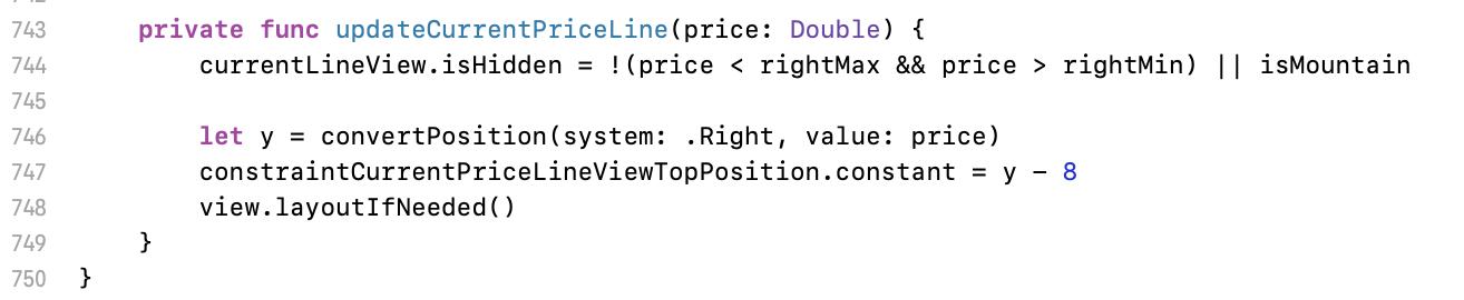
744 行設定現價線顯示的條件,在於超出畫面或分時圖時設為隱藏不顯示。
Line 744 is to set the hidden condition of current price line. It hides when out of range or showing mountain chart.
746 行又一樣的,只是座標轉換。
Line 746 is coordinate convert.
747 行是因為橫線是要整個現價 view 置中的位置,而我這個 view 的高度設定為 16,所以才需要 8 的調整。
Line 747 is because the line is at the centre of current price view which is height 16, so I need a 8 adjustment.
走到這邊,畫圖的工作大致上已經完成。執行程式,已可以看到該有的基本元素(K 線、兩種技術指標、分時圖)都有了,畫面也可以左右滑動。回頭來看一下文章最一開始的最終結果附圖。
For now, most of task are complete. We can see all the basic components ( K chart, two types of technical indicator, mountain chart ) when running, and we can scroll the chart. The final result is as below image.
來到最後一步,做縮放。將 commit 切到 a2cd491。
The last step for pinch, please checkout commit a2cd491.
加入一個手勢,這邊設定不是硬道理,只是我自己試出覺得效果比較好的參數。
Add a gesture recognise. The following setting is only my personal recommend.
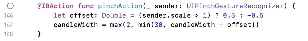
146 行設定縮放發生時,大小的變化。太大的話畫面會縮放太快;太小的話就會拉得很慢。
Line 146 is the speed for zooming. If the value is too big, the chart change suddenly; if too small, users feel very hard to zoom.
147 行設定每根蠟燭的最大與最小寬度。至少 2 以上,否則上下影線就無法顯示,或 MACD 柱會變得不好看。
Line 147 is the width for each candle. At least 2, otherwise upper/lower shadow lines are all in the body or ugly MACD histogram.
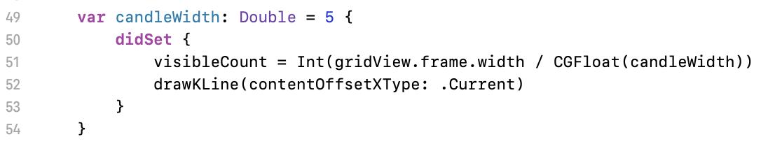
49 行這邊是因應寬度改變後,程式還要做的事:計算可視數量、重繪線圖。這邊的 contentOffsetXType 是避免畫面跑掉的 workaround,應該會有更流暢的作法。
Line 49 is for the task after width changed: count visible lines, redraw chart. contentOffsetXType is a workaround to avoid chart move unexpectedly. Might have a better way to do that.
四、後續能再練習的方向:
- 依需求決定進入線圖頁所需要的 interface 設計
- 左滑載入更多(中等)
- 最後一根蠟燭更新(容易)
- 久置後多出一根新蠟燭(中等)
- 十字線或其他互動需求(難)
- 資料不夠多時,全部蠟燭應靠右(應該不難)
- 換算座標改成換算價格(中等)
4. Homework
- Design the interface.
- (Moderate) Load more when user scrolls to leftmost.
- (Easy) Realtime update the last candle.
- (Moderate) Realtime create a new candle when over the duration of selected chart.
- (Hard) Other interact function on the chart.
- (Not quite hard) All candle should be at right if the data is insufficient.
- (Moderate) Convert price instead position convert.
五、總結
5. Summary
以上就是自繪線圖的基礎知識,也是 iOS 好用的繪圖工具-貝茲曲線的應用之一。總結來說,這跟早期沒有 Interface builder 與 Autolayout 的時代做畫面的邏輯一樣,就是設計一個公式進行手動計算物件的座標而已。只要理解了這個原理,就會知道表面上看起來很難的線圖繪製,根本是件很簡單的事。
Here is the basic concept of financial chart drawing, and this is one of the application with Bézier curve. To conclude it, this is just like to make UI without interface builder and auto layout system which is to calculate the coordinate manually with a formula. If you know this theory, you will find out that the chart you think very complex is actually very easy.
知道基礎原理,就可以自己設計合用的線圖,不需要依賴套件。這對於應付複雜的商業邏輯來說很重要,商業邏輯的要求越細,就越會遇到要客製化的部件,通用化的公用套件架構此時就會顯得綁手綁腳,怎麼調都調不到跟需求一樣。這也是為什麼學習任何事情,基本功很重要的原因,有了基本功為底,才能更靈活的因應各種需求。
Know the theory for drawing, then you can design your fully customised, controllable chart kit without any 3rd party. This is very important to solve the business logic. If clients make very details specification, you need do more customise. And it’s very hard to customise very details if you use a 3rd party library. That’s why it’s important to learn the fundamental knowledge when we learn a new thing. We can flexibly cope the requirement if we understand the base theory.
六、參考資料
6. Reference
無,全部自幹。最多就是上網查詢貝茲曲線用法。
Only official documents of Bézier curve using.
七、聯絡資訊
7. Contact
作者本名:王維仁 Wei Jen Wang
社群用名:黃紋吸蜜
出沒地點:每週二晚上七點半 iOS Taipei @ mit.jobs(每月第一個週二會在 Swift Taipei @ 屋脊)
電子郵件:weijen.wang@thinkpower-info.com
Real name: 王維仁 Wei Jen Wang
Name on Social networking: 黃紋吸蜜
Where can find me: iOS Taipei @ mit.jobs every Tuesday 7:30 PM or Swift Taipei @ 屋脊 every first of Tuesday in a month
E-mail: weijen.wang@thinkpower-info.com