css
CSS:文字漸層與鏤空遮罩效果
2022/04/25 10:00:00
0
11883
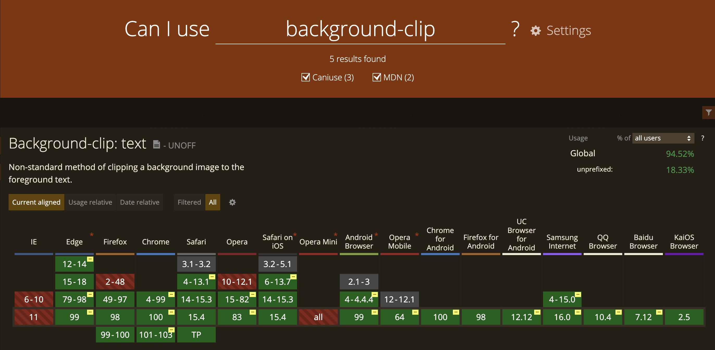
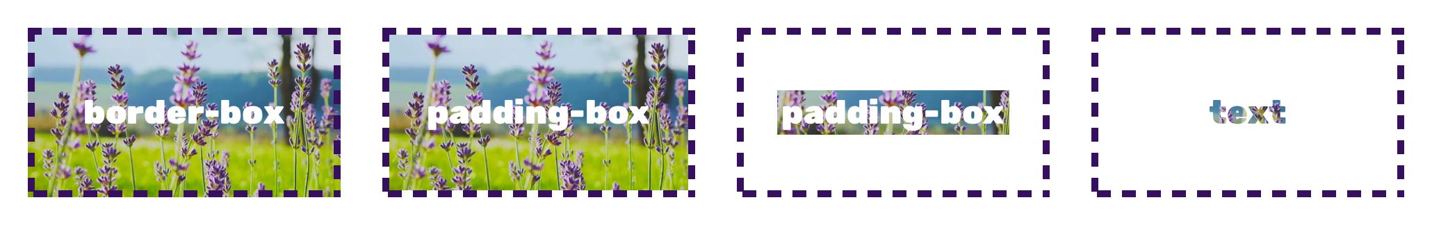
CSS 屬性 background-clip 說明:
- border-box:背景延伸至邊框外,並在邊框下層
- padding-box:背景僅延伸至邊框內,包含內間距 padding
- content-box:背景僅呈現於內容範圍
- text:背景裁剪成文字的前景色
接下來就透過 background-clip: text 來設置文字漸層與鏤空遮罩效果。
首先在 html 建立好三個範例:
<div class="flex">
  <!-- 範例一 -->
  <div class="section1">
    GRADIENT
  </div>
  <!-- 範例二 -->
  <div class="section2">
    FLOWER
  </div>

</div>
<!-- 範例三 -->
<div class="section3">
  <div class="mask">
    <div class="text">
      FLOWER
    </div>
  </div>
</div>
第一個範例 - 文字漸層效果,開始設定 css:
- 在 google fonts 選了一個合適的字體
- 文字設為透明
- 背景設定 45度、#F37335、#FDC830、80% 漸層色
- background-clip 設定為 text
就完成文字漸層效果了。

@import url("https://fonts.googleapis.com/css2?family=Rubik:wght@900&display=swap");
* {
  font-family: "Rubik";
  margin: 0;
  padding: 0;
}
.flex {
  display: flex;
}
/* 範例一 */
.section1 {
  width: 50vw;
  height: 50vh;
  font-size: 120px;
  line-height: 50vh;
  text-align: center;
  color: transparent; /* 文字顏色設定透明 */
  background-image: linear-gradient(45deg, #F37335, #FDC830 80%); /* 設定漸層角度及顏色 */
  -webkit-background-clip: text; /* 背景裁剪成文字的前景色 */
  background-clip: text;
  border-right: 1px solid #eee;
}
第二個範例 - 文字背景效果:
- 在免費線上圖庫 unsplash 選張漂亮的圖
- 文字同樣設為透明
- background-clip 設定為 text
就完成文字背景效果了。

/* 範例二 */
.section2 {
  width: 50vw;
  height: 50vh;
  background-image: url("https://images.unsplash.com/photo-1483519396903-1ef292f4974a");
  background-repeat: no-repeat;
  background-position: center center;
  background-size: cover;
  font-size: 120px;
  line-height: 50vh;
  text-align: center;
  color: transparent; /* 文字顏色設定透明 */
  -webkit-background-clip: text; /* 背景裁剪成文字的前景色 */
  background-clip: text;
}
第三個範例 - 背景裁剪效果,這裡分為三層設定,背景、透明遮罩、文字:
- 同樣在免費線上圖庫 unsplash 選張漂亮的圖,設置於背景層
- 設定一層 #FFFFFF 透明度 60% 的遮罩層
- 文字也是設為透明
- background-clip 設定為 text,文字層也設定同樣的背景,呈現文字裁剪後效果

/* 範例三 */
.section3 {
  width: 100vw;
  height: 50vh;
  background-image: url("https://images.unsplash.com/photo-1507646871303-331b8f659227");
  background-repeat: no-repeat;
  background-position: center center;
  background-size: cover;
}
.mask {
  background-image: rgba(255, 255, 255, 0.6); /* 白色透明度60% */
  width: 100vw;
  height: 50vh;
}
.text {
  background-image: url("https://images.unsplash.com/photo-1507646871303-331b8f659227");
  background-repeat: no-repeat;
  background-position: center center;
  background-size: cover;
  font-size: 120px;
  line-height: 50vh;
  text-align: center;
  color: transparent; /* 文字顏色設定透明 */
  -webkit-background-clip: text; /* 背景裁剪成文字的前景色 */
  background-clip: text;
}
各瀏覽器支援請參考 Can I use - Background-clip: text