用CSS Animation寫出text revealing動畫
在一般的網頁上通常會有最吸睛的大標題,若剛好是設計視覺性強類型的網頁,那麼為標題加上文字揭露動畫一定會更有效果!
----
Step 1. html架構
<div class="container">
  <h1>
    <span></span>
    <span id="a">CSS</span>
    <span id="b">IS</span>
    <span id="c">AWESOME</span>
  </h1>
</div>
在html的部分,先將想要加上揭露效果的文字打上,並在文字前加上一個空白的<span> tag,做為揭露效果中擋住文字的長方形元素。
Step 2-1. 文字Css撰寫
在h1的部分先設定了文字的大方向樣式:行高、字體、排列方式為斷行等等:
h1 {
  margin: 0;
  font-size: 4rem;
  display: inline-flex;
  align-items: flex-start;
  flex-direction: column;
  line-height: 1.2;
  font-family: "Gill Sans", "Gill Sans MT", Calibri, "Trebuchet MS", sans-serif;
}
span {
  display: flex;
}
接著進入 #a #b #c 三行文字的設定:
#a {
  color: #ea4335;
  background-color: white;
}
#b {
  color: #fbbc05;
  background-color: #fff;
}
#c {
  color: #34a853;
}
Step 2-2. 遮蓋之長方形Css撰寫
前面提到,遮蓋文字的長方形我們使用了 <span> 做為它的架構,因此接下來就要來設定長方形的屬性:
.container {
  position: relative;
  display: block;
  padding: 1vmin;
  overflow: hidden;
}
span:first-child {
  display: flex;
  position: absolute;
  height: 4rem;
  width: 10px;
  background-color: white;
  z-index: -100;
  transform: translate(10rem, 0rem);
}
此處使用了頭尾選擇器來指定第一個<span> tag ,也就是長方形來撰寫樣式。
 ---> 在這邊可以看到,長方形進入畫面的方向從第一行開始依序是:右至左 > 左至右 >右至左
因此我們需要將長方形的起始位置往右移動,所以設定了 transform: translate(10rem, 0)。
在這邊要注意的是,長方形需要用定位的方式定在文字的上方,因此最外層的.container需要加上position: relative;的屬性。
Step 3-1. 文字預設隱藏的動畫撰寫
#a {
  color: #ea4335;
  background-color: white;
  animation-name: text-hide;
  animation-duration: 0.5s;
  animation-delay: 0s;
}
#b {
  color: #fbbc05;
  background-color: #fff;
  animation-name: text-hide;
  animation-duration: 1s;
}
#c {
  color: #34a853;
  animation-name: text-hide;
  animation-duration: 1.4s;
}
@keyframes text-hide {
0% {
color: var(--white);
}
95% {
color: var(--white);
}
}在這個步驟我們把#a #b #c 三行文字都加上了名為 “text-hide” 的動畫,
此動畫讓文字在各自的動畫過程中 0% ~ 95% 文字都會是白色的狀態,而最後會返回原始設定的紅、黃、綠色,
這樣就營造出像是原本文字隱藏,而最後文字出現的效果。
另外將這三行文字分別加上animation: duration屬性,讓它們各自以0.5秒、1秒、1.5秒的時間進行以上動畫。
Step 3-2. 長方形行動路線的動畫撰寫
span:first-child {
  display: flex;
  position: absolute;
  height: 4rem;
  width: 10px;
  background-color: white;
  z-index: -100;
  transform: translate(10rem, 0rem);
  animation: rectangle-show 2s ease-out;
}

@keyframes rectangle-show {
  0% {
    background-color: #ea4335;
    transform: translate(10rem, 0rem);
    z-index: 2;
  }
  20% {
    background-color: #ea4335;
    transform: translate(0rem, 0rem);
  }
  25% {
    background-color: #ea4335;
    transform: translate(-9rem, 0rem);
  }
  30% {
    background-color: #fbbc05;
    transform: translate(-9rem, 5rem);
    width: 10rem;
  }
  40% {
    background-color: #fbbc05;
    transform: translate(0rem, 5rem);
    width: 20rem;
  }
  50% {
    background-color: #fbbc05;
    transform: translate(0rem, 5rem);
    width: 25rem;
  }
  60% {
    background-color: #34a853;
    transform: translate(0rem, 9.5rem);
    width: 27rem;
  }
  80% {
    transform: translate(-10rem, 9.5rem);
    background-color: #34a853;
  }
  89% {
    transform: translate(-20rem, 9.5rem);
    background-color: #34a853;
    z-index: 2;
  }
  91% {
    z-index: -100;
    background-color: var(--white);
  }
  100% {
    z-index: -100;
    background-color: var(--white);
  }
}
首先,我們先將長方形 - span:first-child 加上名為 “rectangle-show” 、 時長2秒的動畫。
接著來分解落落長的關鍵影格每個階段代表什麼意思:
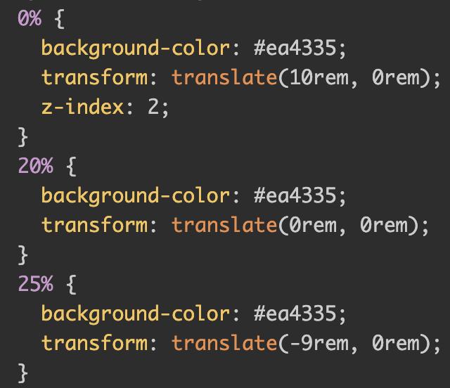
以這段為例,在這個時長2秒的動畫中,0% ~ 25% 為遮蓋第一行 "CSS" 文字的過程,可以看到在這三部分長方形背景色都設定為紅色,
而位置的變化為 (10rem,0) -> (0rem,0rem) ->(-9rem,0rem) 以下以圖解說明:
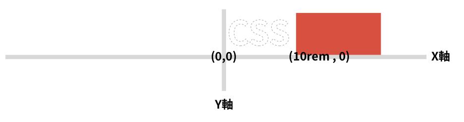 -->在0% (0秒) 時長方形位置在白色的"CSS"右方
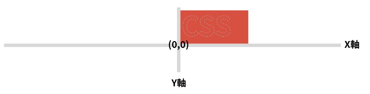 -->在20% (0.4秒) 時長方形位置蓋在白色的"CSS"上方
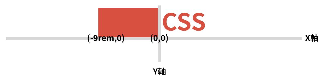 -->在25% (0.5秒) 時長方形位置在變回紅色的"CSS"左方
由以上圖解可以知道,在0.5秒時紅色長方形移到"CSS"左邊,而此時CSS也剛好變回紅色。
那在剩下的兩行文字動畫效果寫法以此類推,只是因文字長短不一,會在某些關鍵點調整長方形的寬度以遮蓋整行文字的差異而已。
要特別注意的是,在這整塊元素的最外層 .container 加上了 overflow: hidden; 的屬性,
有了這個屬性才能夠讓超出去左邊的長方形被隱藏掉,才有今天展示的動畫效果喔!
那麼就再來複習一次完成後的文字揭露動畫吧~
----
參考來源:
https://codepen.io/gambhirsharma/pen/jOxXxXa