html
css
footer置底的五種方式
2020/10/05 10:00:00
0
52521
網頁切版時常會需要考慮footer需要保持置底還是隨文章高度放置的問題,置底可以保持網頁的美觀,不需考慮網頁內容過短時該如何處理,但若是每一頁內容都很長時,則可不需要另外多做這方面的設定。
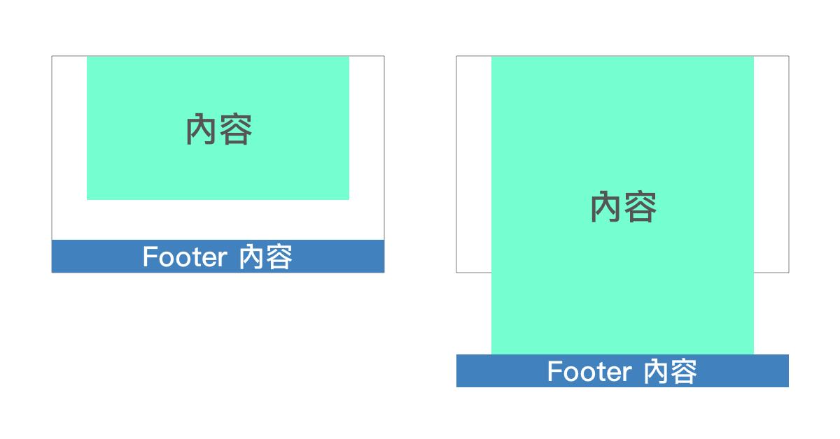
維持置底,需要注意的是並不是讓他像position: fixed狀態(不管滑鼠如何滾動都維持在瀏覽器最下面),也不是希望他像sticky一樣固定維持在容器內部,而是在內容少時可以沾黏在瀏覽器最底部,內容多時可以沾黏在內容的最底部固定在頁面的最下方。
[方法1]
高度100%,內容區塊下方margin為負,數值跟隨footer高度做調整。
<body>
  <div class="wrapper">
    <div class="content">
      內容區塊
    </div>
  </div>
  <footer class="footer"></footer>
</body>
html, body {
height: 100%; /*外層高度100%*/
margin: 0;
}
.wrapper {
min-height: 100%; /*外層高度100%*/
margin-bottom: -50px; /*隨footer高度需做調整*/
}
.contant{
padding-bottom: 50px; /*避免文字超出瀏覽器時,內容區塊不會和footer打架*/
}
.footer{
height: 50px; /*設定footer本身高度*/
background-color: red;
}
[方法2]
高度100%,內容區塊下方padding間距與footer高度一樣, footer下方margin為負。
<body>
  <div class="wrapper">
    <div class="content">
      內容區塊
    </div>
  </div>
  <footer class="footer"></footer>
</body>
html, body {
height: 100%;
margin: 0;
}
.wrapper {
min-height: 100%;
}
.content {
padding-bottom: 50px; /*隨footer高度需做調整*/
}
.footer {
height: 50px; /*設定footer本身高度*/
margin-top: -50px; /*隨footer高度需做調整*/
background-color: blue;
}
[方法3]
使用calc()計算減少內容區塊高度,達到置底效果。
<body>
  <div class="wrapper">
    內容區塊
  </div>
  <footer class="footer"></footer>
</body>
html, body {
height: 100%;
margin: 0;
}
.wrapper {
min-height: calc(100% - 50px); /*減去footer高度*/
}
.footer {
height: 50px; /*設定footer本身高度*/
background-color: yellow;
}
[方法4]
使用flex與flex-grow撐滿footer以上的區塊方式,達到footer置底。
<body>
  <div class="wrapper">
    內容區塊
  </div>
  <footer class="footer">footer內容footer內容footer內容footer內容footer內容footer內容footer內容</footer>
</body>
html, body {
height: 100%;
margin: 0;
}
body {
display: flex; /*使物件依序排列*/
flex-direction: column; /*使物件垂直排列*/
}
.wrapper {
flex-grow: 1; /*可佔滿垂直剩餘的空間*/
}
.footer {
background-color: gray;
}
[方法5]
使用grid排版方式使footer置底。
<body>
  <div class="wrapper">
    內容區塊
  </div>
  <footer class="footer">footer內容footer內容footer內容footer內容footer內容footer內容footer內容</footer>
</body>
html {
height: 100%;
}
body {
margin: 0;
min-height: 100%;
display: grid; /*使用grid排版*/
grid-template-rows: 1fr auto; /*將上半部設置為一個單位,剩下的部分設為自動高度*/
}
.footer {
background-color: green;
grid-row-start: 2;/*欄位從第二條橫線開始*/
grid-row-end: 3;/*欄位從第三條橫線結束*/
}
以上五種方式,皆可製作出內容少時可以沾黏在瀏覽器最底部,內容多時可以沾黏在內容的最底部固定在頁面的最下方的頁面,大家有興趣可以試試看。
參考資料
https://css-tricks.com/couple-takes-sticky-footer/
https://cythilya.github.io/2017/04/06/flexbox-advance/
https://css-tricks.com/snippets/css/complete-guide-grid/
https://www.w3schools.com/css/css_grid_container.asp